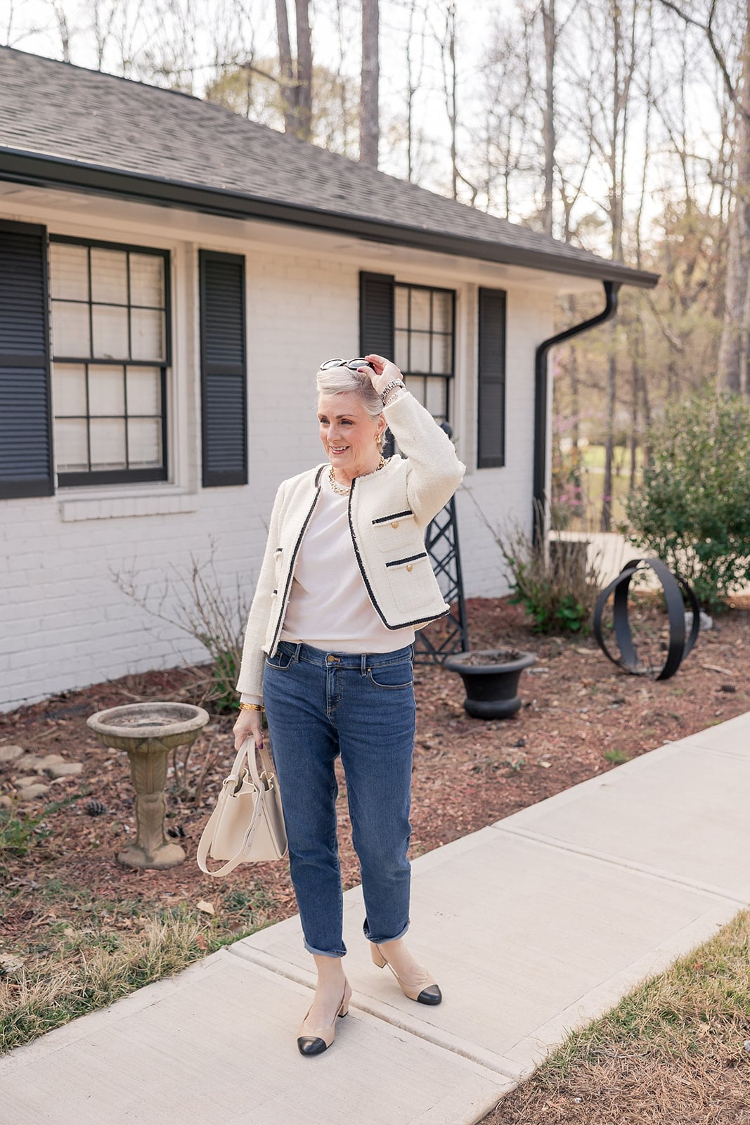


There’s something a color does to your mood that a neutral simply cannot. I love a good neutral — every smart wardrobe is built on them, and I’ll defend my oatmeal linen pants and white tees until the cows come home. But nothing beats a pop of color, especially when the temperatures climb. Color lifts you. It catches the light. It makes you stand a little taller in the mirror before you walk out the door, and it makes the woman at the next table smile when you pass. That little flutter of “oh, this is fun again” — that’s what color gives you. And after a few summers of quiet-luxury everything, I think we’re all ready to feel it.
Here’s the short version if you’re in a hurry: the five biggest summer 2026 colors after 50 are butter yellow, cobalt blue, peony pink, grades of green, and burnt orange — and the easiest way to wear any of them past 50 is to anchor one bold piece with one classic neutral. That’s the whole rule. Below, I’m walking you through each color, showing you how I’m styling them from my own closet, and sharing the pieces I’ve been reaching for on repeat.
(If you’re catching up on this season’s color story from the start, my spring 2026 color guide is the companion piece to this one — same conversation, lighter weight fabrics.)
Quick Take: The 5 Summer 2026 Colors After 50
- Butter yellow — the soft, creamy hold-over from 2025, now softer and more wearable.
- Cobalt blue — the saturated, joyful blue that’s replacing navy for summer.
- Peony pink — dreamy, romantic, and a far cry from Barbie pink.
- Grades of green — from Kelly to sage to teal, green is the season’s most versatile statement.
- Burnt orange — warm, grounded, and surprisingly flattering on most skin tones.
Table of contents
- Quick Take: The 5 Summer 2026 Colors After 50
- 1. Butter Yellow: The Color That Surprised Me Most
- 2. Cobalt Blue: The New Navy for Summer 2026
- 3. Peony Pink: Pretty Without Trying Too Hard
- 4. Grades of Green: The Most Versatile Color of the Season
- 5. Burnt Orange: The Unexpected Flatterer
- The One Styling Rule That Makes Bold Color Work After 50
- Common Questions About Wearing Color After 50
- A Final Thought, Grit & Glammer
1. Butter Yellow: The Color That Surprised Me Most
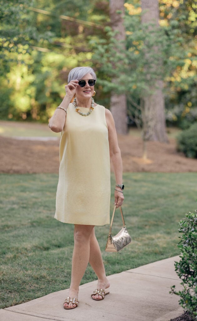
Butter yellow is the color I keep recommending to women who tell me they can’t wear yellow. Because here’s the thing — most yellows are loud. They demand attention, and they don’t always give it back. Butter yellow is the exception. It’s soft. It’s warm. It reads almost like a neutral once you put it on, and it does something genuinely lovely against silver hair. If you’ve been a stranger to yellow your whole life, this is the shade that finally invites you in.
I’ve been reaching for this pale yellow shift dress on the warm evenings when the last thing I want is something fussy. I styled it here with a chunky green-and-gold beaded necklace and jewel-encrusted slides — the trick with butter yellow is to lean into warm metallics rather than fighting them. Gold, brass, raffia, tan leather. Skip the cool silvers and stark whites; you want everything to feel like it’s sitting in the same warm bath.
Wear it with: Gold jewelry, raffia or straw bags, tan sandals, and a denim jacket for cooler nights.
💛 Amazon Affordable Alternative: Amazon Essentials and PRETTYGARDEN both make a sleeveless A-line shift in butter yellow for under $50.
2. Cobalt Blue: The New Navy for Summer 2026
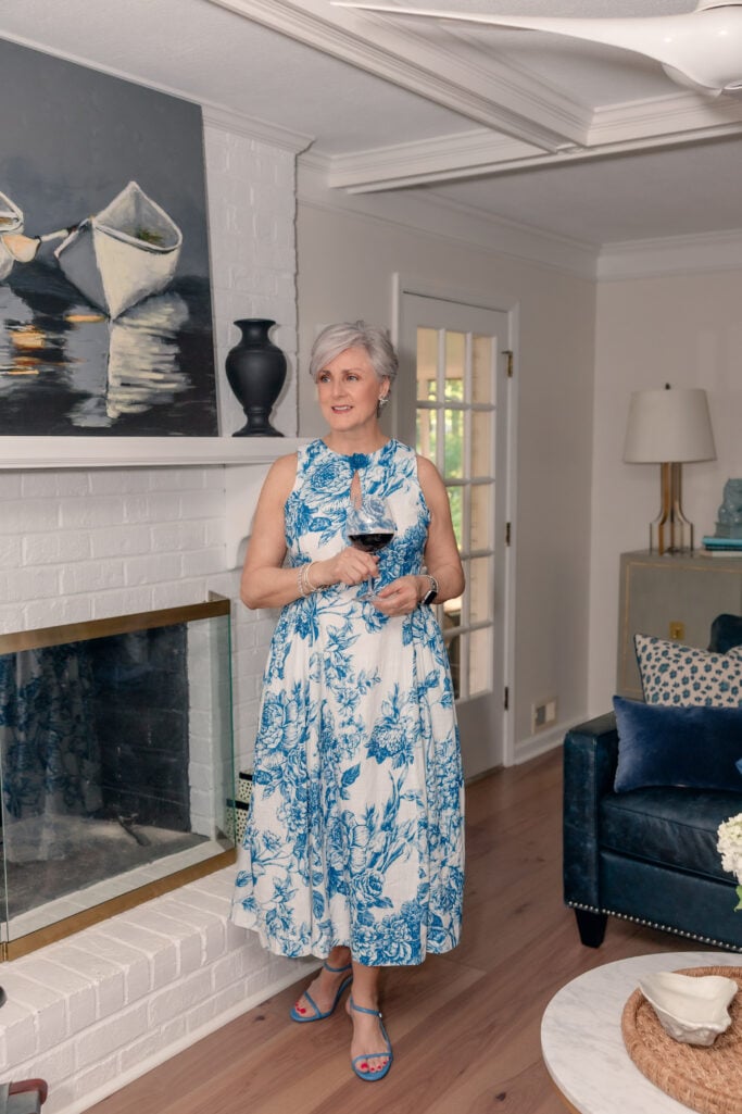
Navy has been the official uniform of women over 50 for about a decade now, and I love it as much as the next girl. But cobalt blue is having a serious moment for summer 2026, and I’m here for it. Where navy whispers, cobalt sings. It’s saturated, it’s joyful, and it does the same job navy does — flattering nearly every skin tone — just with more personality.
I leaned into the blue-and-white version with this midi dress — the print pulls a deeper, more painterly blue, but it lives in the same family. The keyhole neck, fit-and-flare silhouette, and midi length make it the kind of dress you can wear to a daughter’s shower, a summer cocktail party, or dinner on the patio. I styled it with strappy blue sandals to echo the print and let the dress do the talking.
Wear it with: White denim, silver or pearl jewelry, espadrilles, or a crisp white blazer for the office.
💙 Amazon Affordable Alternative: dowerme and PRETTYGARDEN consistently do beautiful toile-style prints in the $40–$60 range.
3. Peony Pink: Pretty Without Trying Too Hard
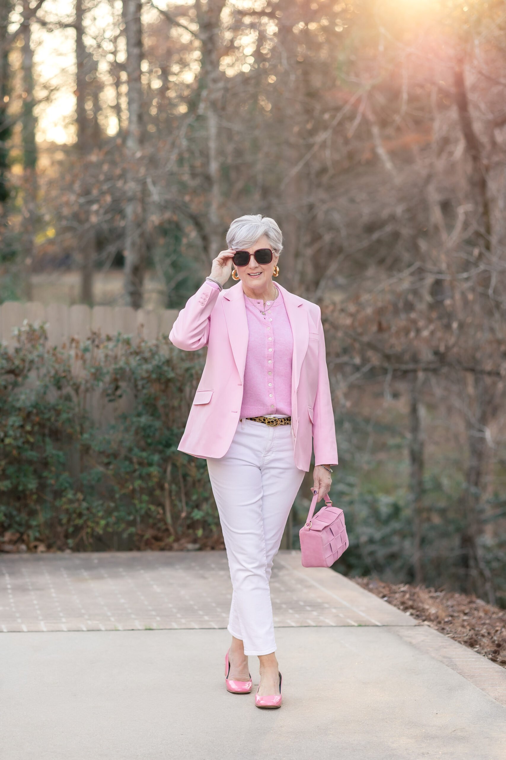
There’s pink and then there’s pink, and I want to be very clear about which one we’re talking about here. We’re not talking about hot pink, Barbie pink, or any pink that makes a noise when it enters a room. We’re talking about peony pink — that soft, dreamy, slightly dusty pink that looks like the inside of the flower it’s named after. It’s romantic without being saccharine, and it’s genuinely one of the prettiest colors a grown woman can wear.
These palm-print pants are the perfect example. The pink is the star, but the tan and ivory in the print keep everything grounded, and the tan ribbed polo I paired them with picks up the warm tones in the palm fronds. It’s a look that’s playful but pulled together — exactly the kind of outfit I want in my closet for a summer lunch out.
Wear it with: Tan, ivory, raffia, gold jewelry. Avoid stark white, which can make pink look chalky.
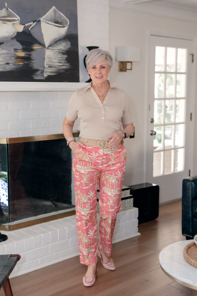
💗 Amazon Affordable Alternative: Palm-print pants are a tougher find on Amazon, but GRAPENT or Hybrid & Company— both make a flattering pull-on pant in peony pink for under $40.
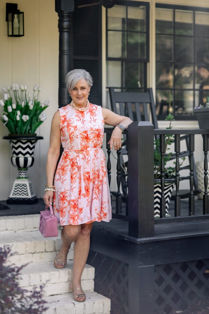
For something a little dressier, this pink-and-coral floral fit-and-flare dress is the kind of piece that does all the work for you. The tie waist gives it shape; the print blends peony pink with warm coral, bridging two trend colors at once; and the silhouette is universally flattering. I styled it with a pink suede top-handle bag, gold strappy sandals, and a pearl statement necklace — pearls and peony pink were made for each other. It’s the dress I’d wear to a summer baby shower, a Sunday brunch, or dinner on the porch with the people I love most.
4. Grades of Green: The Most Versatile Color of the Season
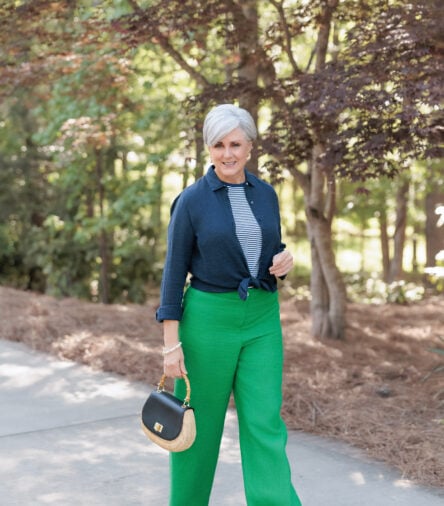
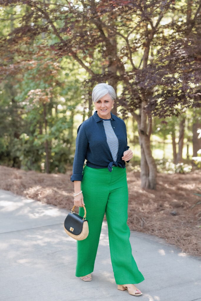
Of all five colors on this list, green is the one I’m wearing most often — and the one I’d recommend first if you’re dipping a toe into color after years of beige. “Grades of green” is the phrase fashion editors are using, and it’s the right one, because green is showing up everywhere from soft sage to deep emerald to that gorgeous Kelly green I keep talking about.
Here’s why green works so well after 50: it reads as a neutral once you start treating it like one. The same way you’d reach for navy or camel, you can reach for a green topcoat, a pair of green pants, or a green knit — and the rest of your wardrobe will play along. I’ve been wearing these Kelly green linen wide-leg pants with a navy linen shirt knotted over a striped tee. The navy and the stripes do all the classic heavy lifting; the green gets to be the fun.
💚 Amazon Affordable Alternative: Feiersi and IWOLLENCE both make a wide-leg pant in true Kelly green for around $50.
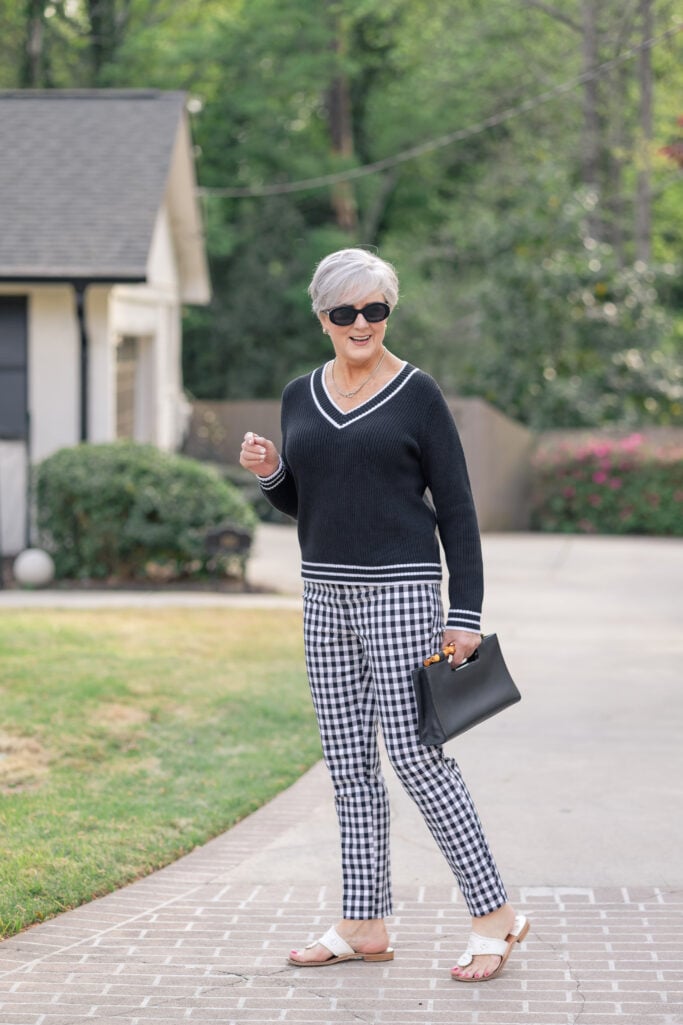
And on cooler mornings, this Kelly green car coat has been the most fun I’ve had with outerwear in years. I’m wearing it here over black-and-white gingham pants and leather slip-on sneakers — proof that bold color and classic pattern can absolutely share a closet.
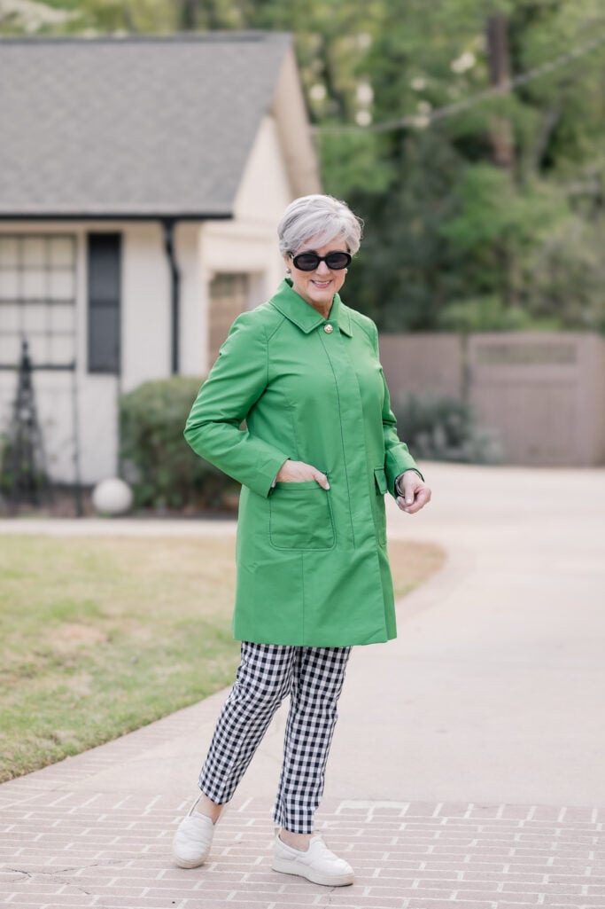
Wear it with: Navy, white, gingham, denim, tan leather, gold, or pearl jewelry.
5. Burnt Orange: The Unexpected Flatterer
Burnt orange is the dark horse of summer 2026 colors after 50. I’ve watched dozens of women dismiss orange in dressing rooms over the years — “it’ll wash me out, it’ll look like a traffic cone” — and then surprise themselves when they finally try the right shade. Burnt orange is the right shade. It’s warm and grounded, it plays beautifully with silver hair, and it’s shockingly flattering on a wider range of skin tones than you’d expect.
My favorite way to wear it is in a dress — this eyelet shift with the ruffled neckline is the kind of piece I throw on for an evening at home with friends, gold sandals, glass of red wine in hand, done. The lace texture softens the intensity of the color and keeps it from feeling like a uniform.

For something more casual, I’ve been wearing this pair of red-orange kick flare pants with a white button-down and a camel sweater knotted over my shoulders. It’s preppy. It’s easy. It’s the kind of outfit you can wear from a morning errand to a long lunch without changing a thing.
If burnt orange is calling to you and you want to lean further into the warm-red family, I’ve broken down 7 chic ways to wear red after 50 — from a full monochrome look to a single pop via accessories.
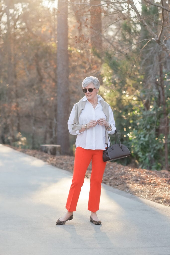
Wear it with: White, camel, denim, leopard print, gold jewelry.
🧡 Amazon Affordable Alternative: ThCreasa or utcoco for an alternative eyelet dress. For the ankle pants, EXCHIC
The One Styling Rule That Makes Bold Color Work After 50
Here’s the secret nobody tells you about wearing color after 50: you still need your classics. You need the navy linen shirt, the white button-down, the black V-neck sweater, the tan polo, the pair of black-and-white gingham pants. The classics are what make the color sing. They’re the steady drumbeat under the melody.
Every single outfit in this post follows the same rule: one bold color, one classic anchor. The Kelly green pants meet the navy shirt. The cobalt floral meets a neutral room. The pink palm print meets a tan polo. The orange dress meets the gold of the hardware. When you pair one statement piece with one quiet, classic companion, color stops feeling like a costume and starts feeling like your closet.
For the deeper case on why this works — and why playing it safe in head-to-toe neutrals is actually the riskier choice after 50 — read my piece on bold color and pattern as the most flattering choice after 50. It’s the philosophical backbone for everything I wear in this post.
Common Questions About Wearing Color After 50
What are the biggest color trends for summer 2026?
The five biggest color trends for summer 2026 are butter yellow, cobalt blue, peony pink, grades of green (from sage to kelly to teal), and burnt orange. According to Pantone’s Spring/Summer 2026 palette and fashion forecasters at Who What Wear and The Zoe Report, bold saturated color is replacing the quiet-luxury neutrals that dominated the past two years.
Can women over 50 wear bright colors?
Absolutely. Style has no expiration date, and bright colors can be especially flattering after 50 because they bring warmth and energy to the face — something neutrals can’t do on their own. The key is choosing saturated, grown-up versions of trendy colors (peony pink instead of Barbie pink, butter yellow instead of neon) and anchoring them with one classic neutral piece.
What color is replacing navy in 2026?
Cobalt blue is the saturated, joyful alternative to navy for summer 2026. It flatters most skin tones the way navy does, but reads as more modern and seasonal. Cobalt works particularly well in dresses, blazers, and statement bags, and pairs beautifully with white, denim, and tan leather.
How do you wear bold color without looking like you’re trying too hard?
Pair one bold-colored piece with one classic neutral anchor — a white button-down, a navy shirt, a black V-neck sweater, a tan polo, or a pair of denim. The neutral grounds the color and keeps the outfit from feeling like a costume. Stick to one statement color per outfit, and let your accessories stay quiet (tan leather, gold, raffia).
What’s the easiest summer 2026 color to wear if I’ve been living in neutrals?
Green is the easiest entry point. It reads as a neutral once you start treating it like one, and it pairs effortlessly with navy, white, denim, and tan — colors you almost certainly already have in your closet. Start with one green piece (a knit, a pair of pants, or a topcoat) and build from there.
A Final Thought, Grit & Glammer
If you’ve been coasting through the past few summers in beige and oatmeal and quiet-luxury everything, this is your nudge. Buy the green pants. Try the butter yellow dress. Reach for the cobalt. The worst thing that happens is you put it on, decide it’s not for you, and return it. The best thing that happens is you catch yourself in the mirror, feel that little flutter of being delighted by your own reflection again, and remember what color can do for a perfectly good summer. That feeling, my friends, is what this whole closet exercise is about. Style has no expiration date, and neither does the joy of getting dressed.


LEAVE A COMMENT