
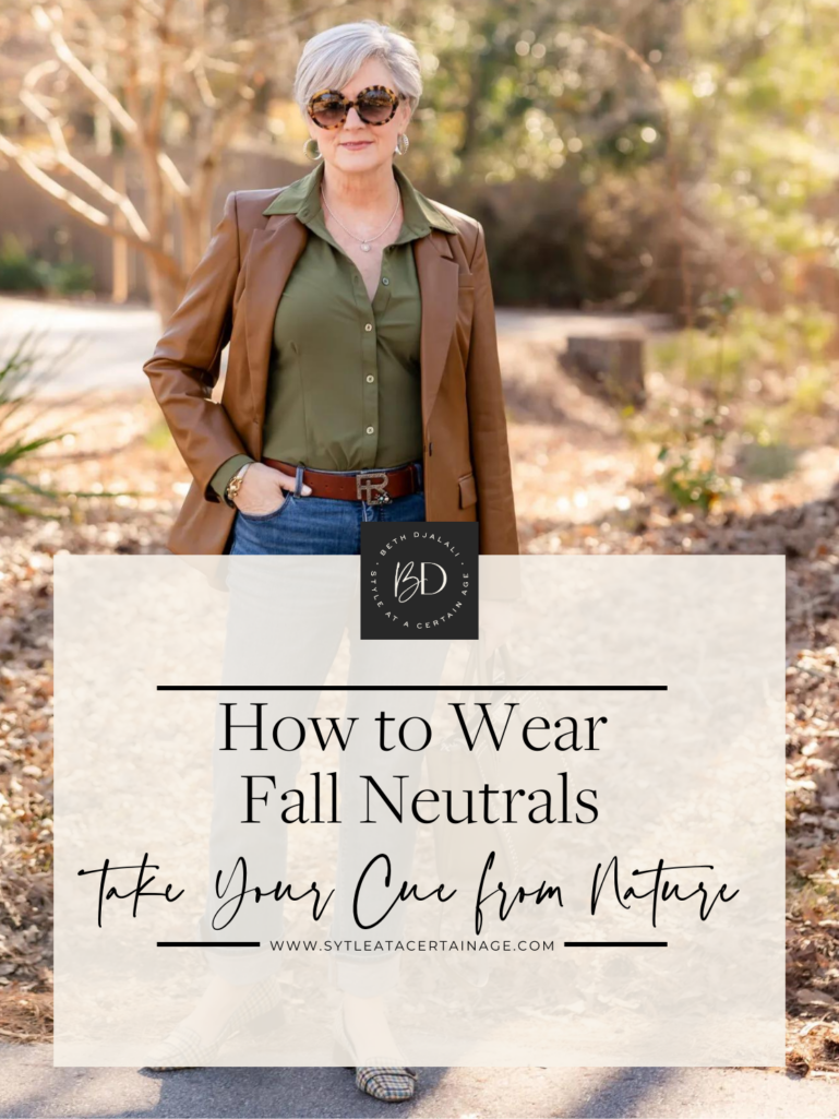

When the seasons change, our color palette shifts too; nature’s vibrant bursts of fall foliage are the first clues when it comes to an autumn color scheme. When we step out of our door, orange, green, cream, gray, rust, blue, and brown are displayed in all their glory. While we all love the colors of leaves that change from green to gold this time of year, many of us groan about wearing an autumn color palette. Take heart. today I’m sharing how to wear fall neutrals.

Years ago, I lived on an island in the Pacific that gave me plenty of opportunities to observe the ocean’s stunning shades of turquoise. Many of you know I head to Tybee Island now and again to spend time at our family beach home. What’s better than a long walk amidst the sandy dunes filled with sandpipers and seagulls? Something is soothing about the waves crashing onto shore with blue skies overhead. And nothing compares to a beach sunset. Watch for the green flash – it truly exists! Tybee Island is a veritable feast for the eyes, along with the entire Atlantic coastline that stretches for miles and miles.
The Summary
Today Beth shares how to wear Fall Neutrals
Look for shoppable Outfit Inspiration
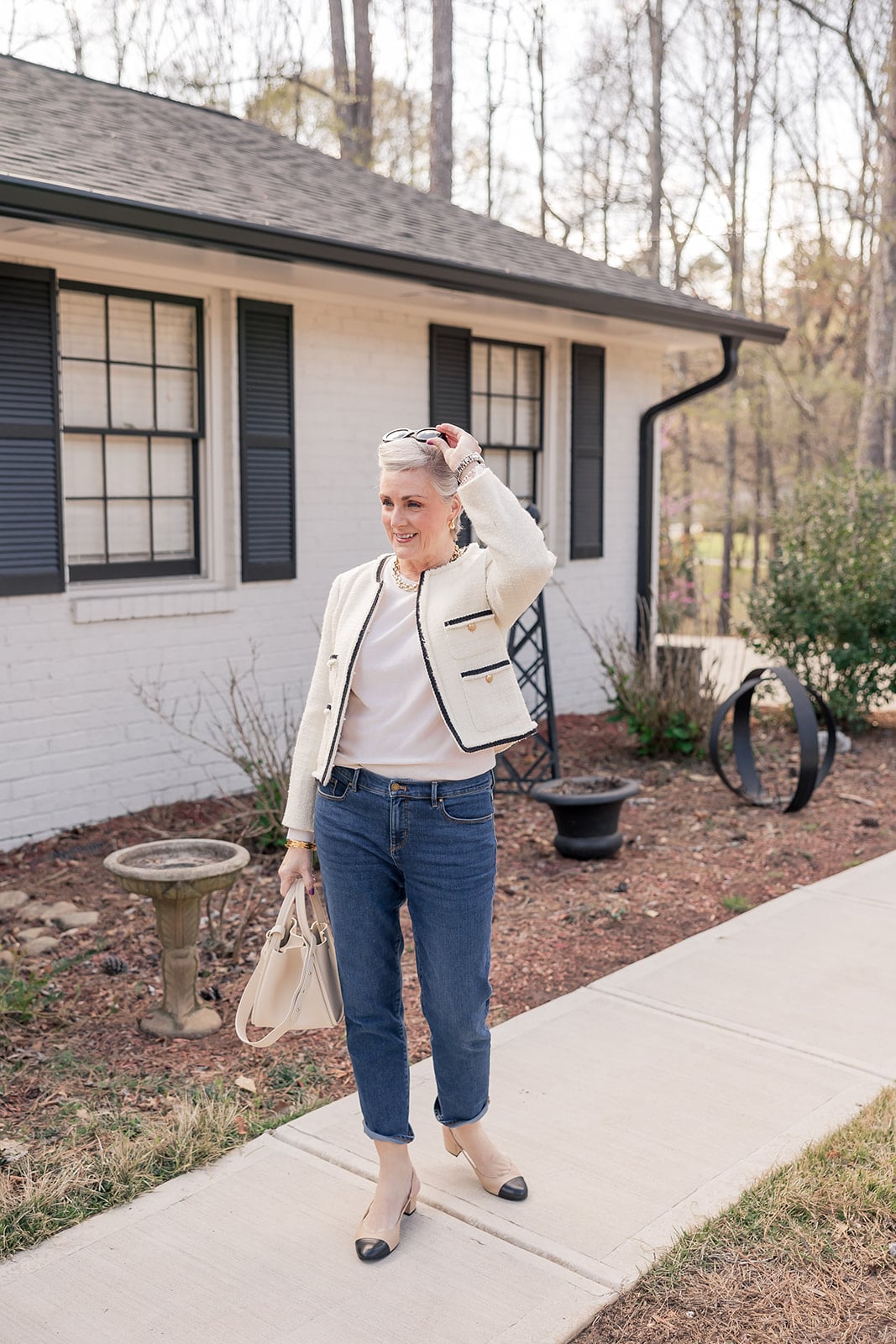
How to Wear Fall Neutrals
Why You Should Embrace Fall Neutrals
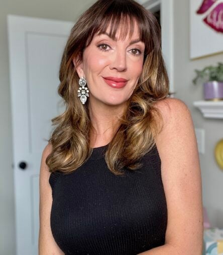
It can be intimidating to wear fall neutrals, especially if you’ve been classified into another color palette based on your skin type or hair color. Many style experts have even gone so far as to say that our jewelry choices need to be correlated with our skin tone too… cool tones, warm tones, winter, or summer is the typical classification. And yes, there are specific colors that truly bring out the best in us. For me, lavender, pink, emerald green, and navy are all tried and true winners. I can’t disagree that silver and platinum metals are complementary to my skin tone. So, does that mean I only wear those colors that look good on me day in and day out? No, I don’t put myself in a color box because I love all the colors and all the jewelry.

Trending Fall Colors
And this year, so many beautiful fall colors that we normally don’t associate with fall are trending. Think Sky Blue and Butter Yellow. Of course, we have camel, magenta, jewel tones, and black, but there are so many shades of these classic fall colors to mix and match that it feels like we have the entire Crayola box to work with.

On any given day, you will see me sporting gold earrings or a beige blouse typically relegated to warm skin tones even though my fair skin classifies me as a cool-tone mama. Listen, if you feel comfortable sticking to a particular color palette, then, by all means, do just that. Style is always about what makes you feel confident when you step out the door. But if you’re like me and want to experiment with colors, here’s a style tip I frequently incorporate. Wear a color scheme that suits your skin tone next to your face. An easy way is to tie a scarf around your neck or add a third layer like a blazer, jacket, or cardigan in a complementary color.

Fall 2024 Color Trends by Pantone from NYFW

Just take a look at the 2024/25 Pantone Color Trends from FWNY. There are some beautiful color pops like Golden Palm and Red Orange. I love the icy blue of Winter Sky – it’s such a great way to add a pop of brightness.
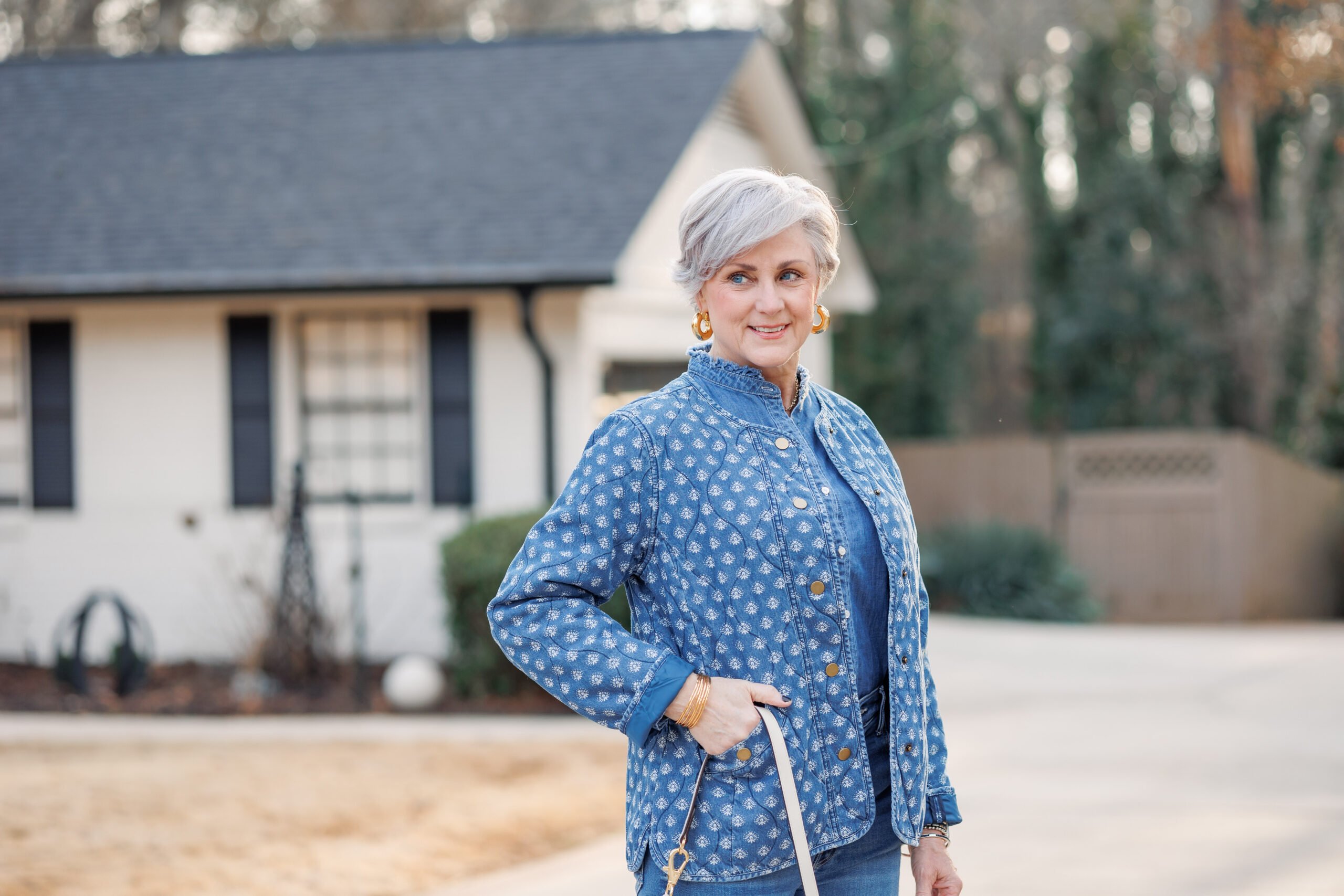
Fall Neutrals Outfit Inspiration
The beach is a perfect way to see much of this fall’s color palette in a beautiful natural display. We have the neutral color of the sand; the beach grass goes from green to golden brown; The ocean ranges from dark blue to grey; and then the sky, with bright blue to muted blues, and grey or brilliant white clouds.

Update this Look for 2024

Everyday Relaxed Leg Jeans | Washable Stretch Silk Blouse | Suede Booties | Neckerchief | Alternative Scarf
Take a walk in the woods and you will be treated to the burgundy, red, and orange tones that bring such richness to the fall color palette. Neutrals are easy to work with in your wardrobe, and changing your neutrals for the seasons is easy when you take your cues from nature.

Recreate the Outfit for 2024
Alpaca-Wool Turtleneck | Easy Travel Pencil Skirt | Knee High Suede Boots | Lee Radziwell Double Bag | Italian Wool Single-Breasted Coat

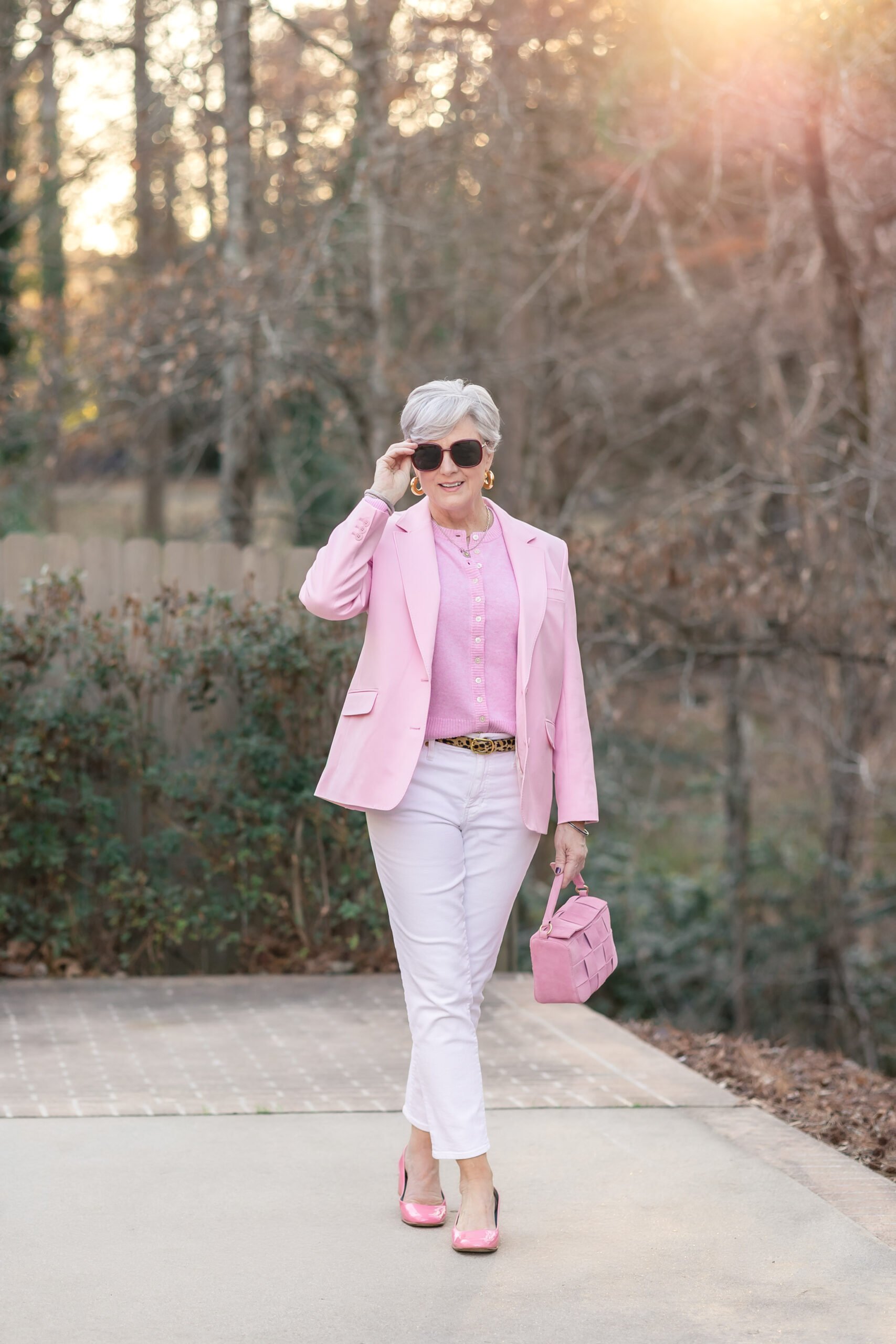
Shop the Outfit
White Denim | Gray Cashmere Shell | Gray Cashmere Cardigan | Similar Metallic Flats | Suede Bucket Bag | Silver Hoops | Silver Bracelet | Caviar Bangle | Caviar Watchband

Recreate this Outfit for 2024
The Cloud Oversized Turtleneck Sweater | Similar Ankle Pant | Suede Kitten Heel Pumps | Similar Shoulder Bag

Recreate this Outfit for 2024
High Waist Straight Ankle Jeans | Similar Spacedye Sweater 1 | Similar Spacedye Sweater 2 | Similar Shoulder Bag | Similar Faux Fur Jacket | Piper Suede Ankle Boots

Recreate the Outfit for 2024
High Waist Straight Ankle Jeans | Mongolian Cashmere Turtleneck Sweater | Oversized Blazer in Wool | Quilted Leather Crossbody | Snakeprint Slip-On Sneakers
In Case you Missed It
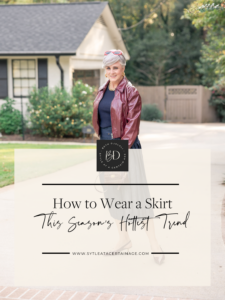
Yesterday, Beth shared how to wear a skirt, this season’s hottest trend. Click the title or image below to read the article.
How to Wear a Skirt: This Season’s Hottest Trend


Very nice outfit. The color analysis? I think ladies know when they wear colors that look nice. Some of the color anaysis “rules” just seem silly to me. Wear what you like, wear what you feel comfortable in. Enjoy the day!
exactly! their simply guidelines. it’s important to color outside the lines.
Beth, your outfit is very attractive but those open toed shoes look very impractical in the sand !
thanks for stopping by! the photoshoot was taken to showcase the beauty of the sand dunes. i didn’t spend the day there with my suede booties or silk blouse. it’s simply a gorgeous backdrop.
It is a beautiful backdrop. I liked the outfit, but nature just took over for me. And yes, your neutrals do blend in. I’m going to keep that thought — being part of my environment — top of mind this fall. Thank you.
nature gives us loads of inspiration when it comes to a color palette.
Beautiful colors & well put together. Thank you for the wonderful tips for Fall. You look amazing in these pic!
thanks so much! i just love this time of year.
Beth your outfit is very elegant
too bad that I can buy the blouse
Enjoy it
there is certain to be a blouse or blue jeans similar to those i’m wearing today in your price range. style doesn’t have an expiration date or a price tag. many readers utilize the post for inspiration then incorporate their style tweaks in their price range.
Beth, love all your outfits ,but when they are gifted or you have a financial arrangement with the the company do you just promote the item or are you truly voicing your true opinion . .P.S. Love you’re posts ,they are really a blessing to the over 50 demographic.
hi, pat! thanks for stopping by. if you have followed the blog or social channels for any length of time, then you know i only partner with brands i know, love, and trust. i turn away about 98% of the brands that reach out to me. rest assured, if there is a sponsored post with Daily Harvest, Nordstrom, T-Mobile, or Lagos jewelry, they have the Style at a Certain Age stamp of approval. i’m truly honored to represent the 50+ women a demographic that’s long been overlooked. today’s post isn’t sponsored, as i clearly state that when i do partner with brands. all of the items in today’s post were purchased by me. hope this helps!
Hi Beth,
You look fabulous as usual, the ocean and views are so beautiful, thank you for sharing your family home retreat. How special this must be for all of you. The ocean is magical isn’t it?
the beach is truly a magical place to be no matter what time of year. thanks for stopping by.
I loved this post, Beth!! Thanks for sharing “permission” to enjoy the colors we live and how to look our best in the selections that may not fit our “color analysis” box. I always appreciate how you mix it up and don’t feel compelled to stay within a gold or silver, warm vs cold guideline in what you choose to wear. I needed to hear this today!😉❤️
color analysis should be used as a tool, not a hard and fast rule. thanks so much for stopping by!
I am considered a winter pallet and try to wear the most flattering colors for me, but sometimes I step out of the box and try the light camels and browns. I like how you added the black zebra scarf to add color, Nice idea.
scarves are a fantastic accessory is so many ways!
I may be wrong here but I thought you said in and earlier post that you and your family Rent the beach house that you go to…..were you and your family able to strike a deal and buy it so that it is all yours?…..that would mean you can go any time you want 🙂
the beach home is ours. when my schedule allows i love to hop in the car and drive to Tybee.
Beautiful post, Beth! The outfit you are modeling looks stunning on you. Thank you also for the color trends this fall. Very helpful..
you are so welcome! thanks for stopping by.
Color season (most flattering colors) is a very interesting topic. I give it a lot of thought, especially when visiting your blog, as you often dress out of your cool tones but look lovely. I think some people can carry that off better than others. As a Soft Summer, I avoid those colors that are truly ghastly on me – anything “goldy”, “yellowy” or “earthy”, which don’t appeal to me anyway. That said, I do love orange and will wear it as a print background, or even solid with scarf, jewelry or 3rd piece in my palette. Just can’t deny myself that orange – or gold jewelry for that matter!
i could never bear to give up gold jewelry or a camel and black color scheme. good for you for incorporating orange into your wardrobe. i just love that color. it’s so vibrant and full of life.
Hi Beth
Thank you for this gorgeous post! I love the beach photos. The color trends are helpful and interesting. I am a cool color palette, but I like to incorporate warm tones, too, if I like the item. Scarves are a great way to keep flattering colors near our faces. Great looks!
i am loving the NYFW color scheme. it’s so nice to see green in the lineup.
Looking at the colour palette, there’s barely any colour I would wear there. Oysters ands greys of course but the advantage of turning 70 next week is that I’ve worked out what lifts my complexion and what doesn’t and so I don’t take note of trends.
‘Trends’ can be expensive mistakes and I kind of think there’s better things to spend money on.
I do love your Tybee shoreline though and especially the wonderful old heritage lighthouse. Lighthouses sing with mystery. More of Tybee please when you have time.
trends don’t have to be expensive mistakes, prue, they can be a great way to stay modern and fresh. the colors this year from NYFW are
drool worthy!
I don’t think I have ever seen or read one of your posts that I haven’t loved. You look awesome in this outfit, as usual. I love wearing different colors and I always switch between gold and silver jewelry. I’m also thrilled to see that the neck scarves are back in style. I used to love accenting an outfit with a neck scarf. Love the animal print scarf with the neutral color blouse. Thanks once again for an inspiring post.
awwww, you made my day! and happy to hear you like to switch between gold and silver jewelry. they both have a time and place. i love them both so how could i decide between one or the other!
Beth, thought of you today as my husband and I are in Tybee this week. We visited the Lighthouse and farmers and artisan market. This is our second time renting here and are considering purchasing a property as well. Your backdrops look very familiar (as we walk the beach every morning) and your “cool” style is truly shown off in these pics. Your Tybee photographer did you good!
Tybee is such a peaceful spot. ssshhhh, don’t tell anyone. we’re still off the radar screen. enjoy!
You never disappoint Beth! Loved this post as usual. I wanted to let you know that under your artful eye, I experimented with new and bold (for me) color choices and silhouettes last fall and was blown away by the confidence I experienced as well as the many compliments I received. Thanks for all the hard work you put into this!
good for you for experimenting with fashion. i always say fashion should be FUN! thanks for stopping by.
Gorgeous outfit in a gorgeous landscape. Those soft colors really suit you! And that blouse is just wow!!! Love your attention to the details which really pull the entire ensemble together!
thanks, beth! i so appreciate you being here.
Hello Beth,
I am new to your blog so I am not familiar with ootd – can you please let me know what this means? 🙂
Your blog is fabulous and I totally love your style!
welcome, kim! i’m so happy you’re here. ootd stands for outfit of the day. hope this helps!