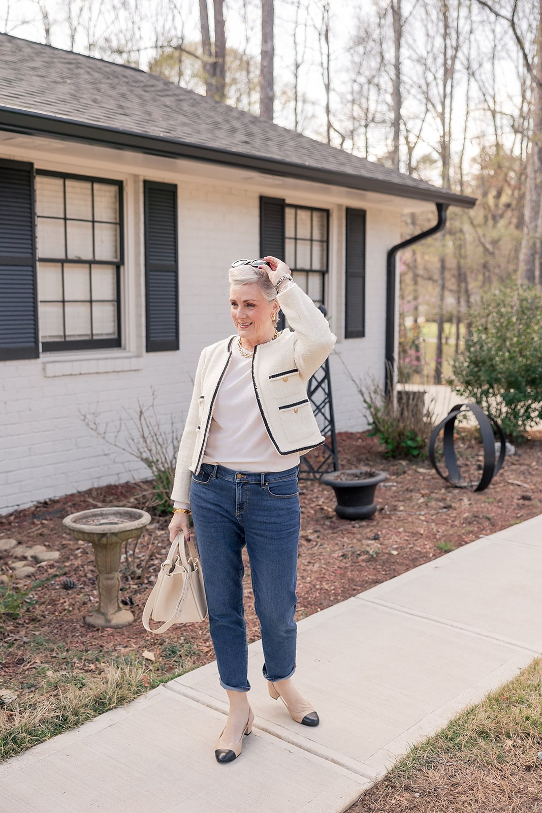


Let me tell you how I used to think about mixing prints: I didn’t. I picked one pattern and built everything else around it in solids. Safe. Sensible. And honestly, a little boring.
The turning point was realizing that stripes aren’t really a print at all — or at least, they don’t behave like one. They behave like a neutral. Put a stripe next to a floral, a toile, an abstract print, and suddenly the stripe looks intentional and the bold print looks curated. The two patterns don’t fight. They just work.
Today I’m sharing three looks that break down exactly how I think about pattern mixing now. Each one uses a different approach — and each one is more approachable than you’d think. There are rules here, but they’re simple ones. Once you know them, you’ll start seeing mixing opportunities everywhere in your closet.
What You’ll Find in Today’s Post
- FAQS – How to Mix Patterns Over 50
- The Formula (Before the Looks)
- Look 1: Stripes + Scenic Print (The Classic Combo)
- Look 2: Stripes + Bold Floral (The Bolder Move)
- Look 3: Tonal Pattern Mixing (The Advanced Move)
- Shop the Pattern Mixing Inspiration
- Accessorize Your Way In
- More Spring and Summer Inspiration
- Closing Thoughts – How to Mix Patterns Over 50
FAQS – How to Mix Patterns Over 50
The simplest formula: start with a stripe. Stripes act as a neutral in pattern mixing — they pair beautifully with florals, toile, abstract prints, and even other patterns. The second rule is to vary the scale — pair a smaller, tighter pattern with a larger, bolder one. And if you want a buffer between the two, a solid white denim jacket does the job perfectly.
The most reliable pairings are stripes with florals, stripes with toile or scenic prints, stripes with abstract prints, and plaid with dots. The key in every case is finding one shared color between the two patterns — that single overlap is what makes the combination look intentional rather than accidental.
Yes — and this is the rule that unlocks pattern mixing for most people. A classic stripe, especially in navy, black, white, or a tonal colorway, reads as a foundational print that plays well with almost anything. Think of it the way you’d think of a solid: it grounds the look and lets the bolder print lead.
Three things: vary the scale of your prints, find one shared color between them, and add a solid piece as a buffer if needed. A white denim jacket, a solid blazer, or even a neutral belt gives the eye a place to rest and immediately makes a mixed-print look feel more polished.
Absolutely — and it’s one of the most stylish moves you can make. The formula is the same: share a color, vary the scale, and let one print be the star while the other plays a supporting role. A stripe tee with a bold print skirt is the easiest entry point.
Tonal pattern mixing means combining prints that live in the same color family — like an olive stripe with an olive floral or abstract print. Because the palette is unified, the two patterns harmonize rather than compete. It reads as sophisticated and intentional, and it’s one of the most wearable approaches to pattern mixing over 50.
The Formula (Before the Looks)
Before we get to the outfits, here’s the cheat sheet:
Rule 1: Treat stripes like a neutral. A stripe goes with almost everything — florals, toile, abstract prints, even other stripes. It’s your foundation piece.
Rule 2: Vary the scale. Pair a smaller, tighter pattern with a larger, bolder one. When two prints are different sizes, they complement rather than compete.
Rule 3: Find one shared color. Look for one color that appears in both prints — even a small accent. That single overlap is what makes the combination look intentional.
Rule 4: Use a solid as a buffer. Not ready to go print-on-print head to toe? A white denim jacket, a solid blazer, or a neutral belt gives the eye a place to rest and makes everything feel more polished.
✨ Beth’s Style Tip: If you’re nervous about mixing prints for the first time, start with a striped tee as your base. From there, almost any patterned bottom will work — because the stripe does the heavy lifting.
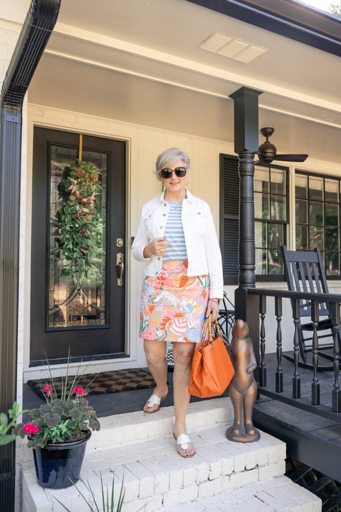
Look 1: Stripes + Scenic Print (The Classic Combo)
This is the look that convinced me print mixing could be effortless. The yellow and white striped tee is doing exactly what a stripe should do — acting as a calm, graphic foundation that lets the toile-inspired skort take center stage. The two patterns share yellow as a connective color, which is why the combination reads as intentional rather than chaotic.
The white denim jacket is the masterstroke here: it’s the solid buffer that ties the whole look together and keeps the eye from being overwhelmed. Yellow sandals echo the stripe. A round white bag keeps it clean. This is the pattern-mixing formula in its most satisfying form.
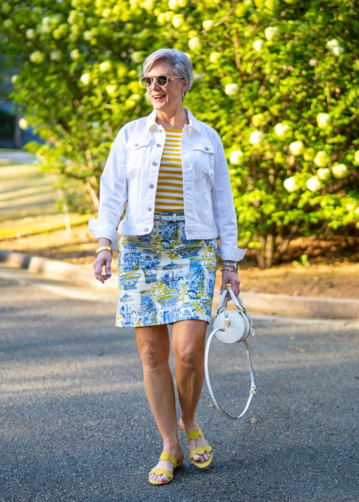
✨ Beth’s Style Tip: When mixing a stripe with a scenic or toile print, let the scenic print be the star. The stripe is the supporting act — it connects the look without competing with the pattern that has all the personality.
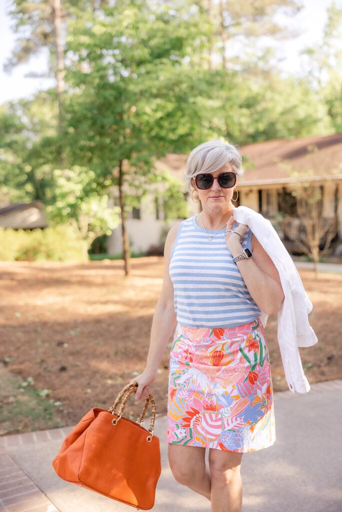
Look 2: Stripes + Bold Floral (The Bolder Move)
This look turns up the volume — and it works because the formula is exactly the same. A classic blue and white stripe tee paired with a vivid multicolor floral mini skirt. The stripe is quieter; the floral is the showstopper. The white denim jacket does its job again as the buffer, pulling both patterns together under one clean layer.
What makes this combination sing is the scale difference: the stripe is tight and graphic, the floral is large and painterly. They occupy different visual territory, so the eye reads them as a deliberate pairing rather than a clash. White Jack Rogers sandals and a warm bamboo-handle tote are exactly the right finishing touches — grounded and relaxed, so the patterns can do their thing.
Recreate Beth’s Look
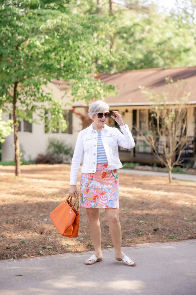
✨ Beth’s Style Tip: A bold, multicolor floral is actually easier to mix prints with than a more subtle one — because it already contains so many colors, there’s always at least one that connects back to your stripe. Let the floral lead and the stripe follow.
Look 3: Tonal Pattern Mixing (The Advanced Move)
This is my favorite kind of pattern mixing — and the most underrated. Instead of contrasting two prints, this look keeps everything within the same color family: an olive and light blue stripe tee with lightweight, wide-leg barrel jeans in an olive floral print. The two patterns are different in scale and style, but unified in tone. The result is sophisticated and completely intentional — it looks like you know exactly what you’re doing, because the palette does all the connecting work.
This is what’s called tonal pattern mixing, and it’s one of the most wearable approaches for women over 50. You get all the visual interest of mixed prints without any of the risk of it looking busy. A sage structured handbag and white sneakers keep the look grounded and modern.
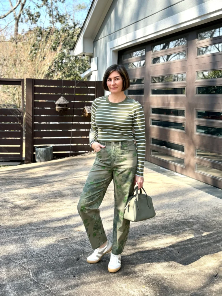
✨ Beth’s Style Tip: Tonal pattern mixing — keeping both prints in the same color family — is the most foolproof approach if you’re just starting out. The palette creates harmony before you’ve even thought about scale or proportion. Start here and build confidence before going bolder.
Shop the Pattern Mixing Inspiration
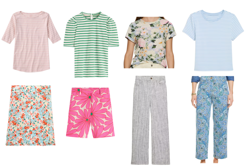
- Pink and White Striped Pima Tee | Pleated Knee-Length Floral Skirt
- Belgravia Linen Shorts | Ali Trim Tee
- The Perfect T-Shirt | Striped Stretch Linen Pants
- Bestee Crewneck Tee | Straight Crop Pants
Accessorize Your Way In
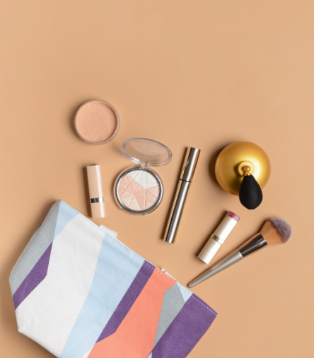
Not ready to commit to a full print-on-print outfit? Start with accessories. A patterned scarf, bag, or belt is a low-risk way to dip your toe into pattern mixing without overthinking it. Layer a leopard print scarf over a striped tee. Add a floral silk scarf to a plaid blazer. Try a printed belt with a polka dot dress. These small touches add visual interest and help you build confidence before going bolder.
Shop Spring and Summer Patterned Accessories
- Large Mulberry Silk Scarf
- Mulberry Silk Neckerchief
- Leopard Print Scarf
- Striped Silk Scarf
- Floral Bandana or Neckerchief
- Animal Print Belt
- Geometric Print Handbag
- Paisley Pocket Square (tucked into a blazer breast pocket)
- Patterned Statement Earrings
- Floral Canvas Book Tote
- Botanical Geena Satchel
- Brahmin Duxbury Satchel
More Spring and Summer Inspiration
- Spring Dresses for Women Over 50: Two Talbots Looks That Do All The Work
- Spring Denim Essentials For Women Over 50: 16 Pieces I am Actually Wearing
- 10 Spring Lip Colors That Flatter Every Skin Tone Over 50
- A New Chapter: Apartment Hunting in Atlanta
- Why Every Petite Woman Needs a Lady Jacket – And How to Wear it
Closing Thoughts – How to Mix Patterns Over 50
You don’t need to overhaul your closet to start mixing prints. You just need a striped tee, one patterned piece, and the confidence to put them together. The formula is simple: shared color, varied scale, solid buffer if you need it. That’s the whole thing. Go find your stripe and start there.
And don’t forget to use code BETH75 for your purchase on a SHOP LEESA MATTRESS. It comes with a 100-night trial so you can truly sleep on it before committing. Read the entire post: A New Chapter: Apartment Hunting in Atlanta


Thanks for the tips! I use stripes in decor when I would need a print with a busy rug. Works like a charm! I just try to keep coordinating colors or at least one or two.
I am reminded of telling my young son that he could put things (tops and shorts) together as long as they both had the same color in them.
He came out wearing a red, white, and blue striped shirt with madras plaid shorts. Both had red and blue.
Well played, young man, well played. I did not ask him to change. 🙂
Did you have your skirts shortened? I love the length of them.
I’ve been wondering about this very thing. I have a pair of linen pants with a subtle tan vertical stripe. I was wondering about pairing it with a white tee with a floral outline in tan also. I thought it might look okay. Now I’m pretty sure I’ll try it someday.