


Key takeaways
- Every great wardrobe is built on neutrals — but neutrals are the foundation, not the whole house.
- Spring and summer are the perfect time to experiment with color — lighter fabrics, brighter light, and the season’s energy make it the lowest-risk moment to try something new.
- Bold color near your face reflects warmth and makes skin look more vibrant — it’s one of the most effective anti-aging style moves available.
- Playing it safe with neutrals alone can actually age you more than a bold print ever would.
- You don’t need to go bold everywhere — one statement piece anchored by neutrals is
And no, that’s not a contradiction.
I was at a writer’s conference in Atlanta yesterday. Looked around the room and saw what I almost always see at events like this: a sea of black. Wall to wall. Which — look, I get it. Black is easy, black is chic, black goes with everything. There is absolutely nothing wrong with black.
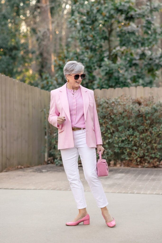
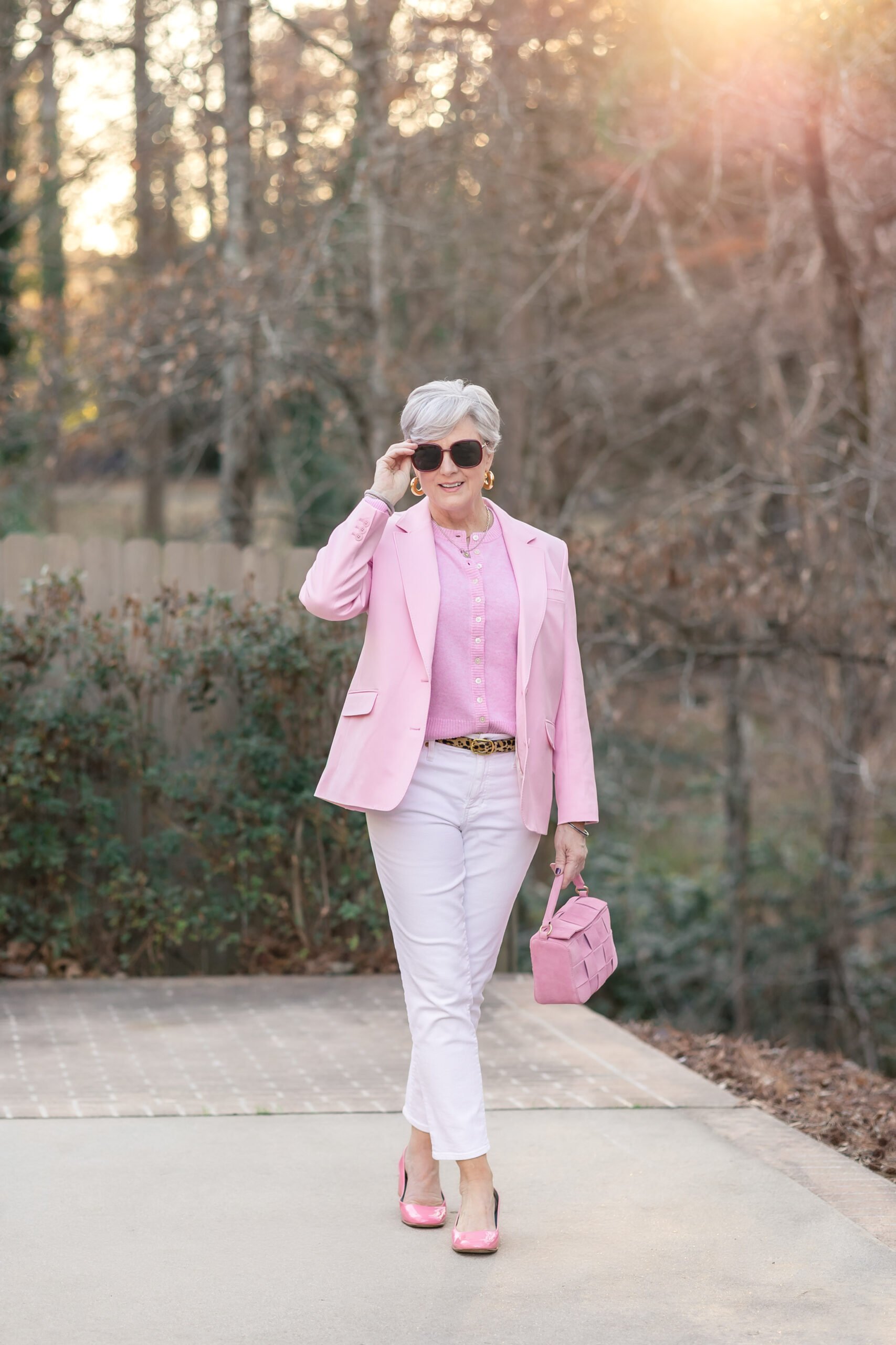
But I was wearing a hot-pink blazer and leopard flats. And I’m going to tell you why I’d make that choice every single time.
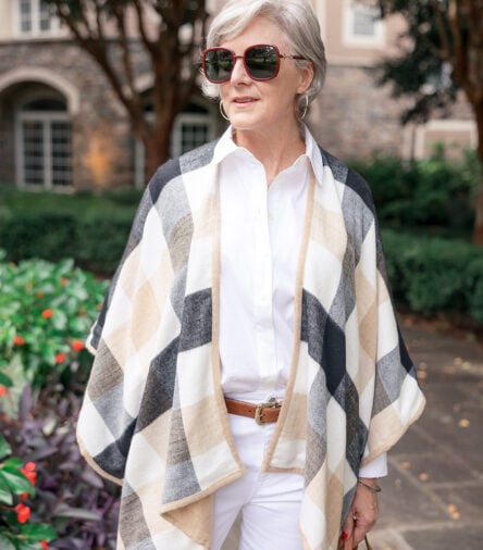
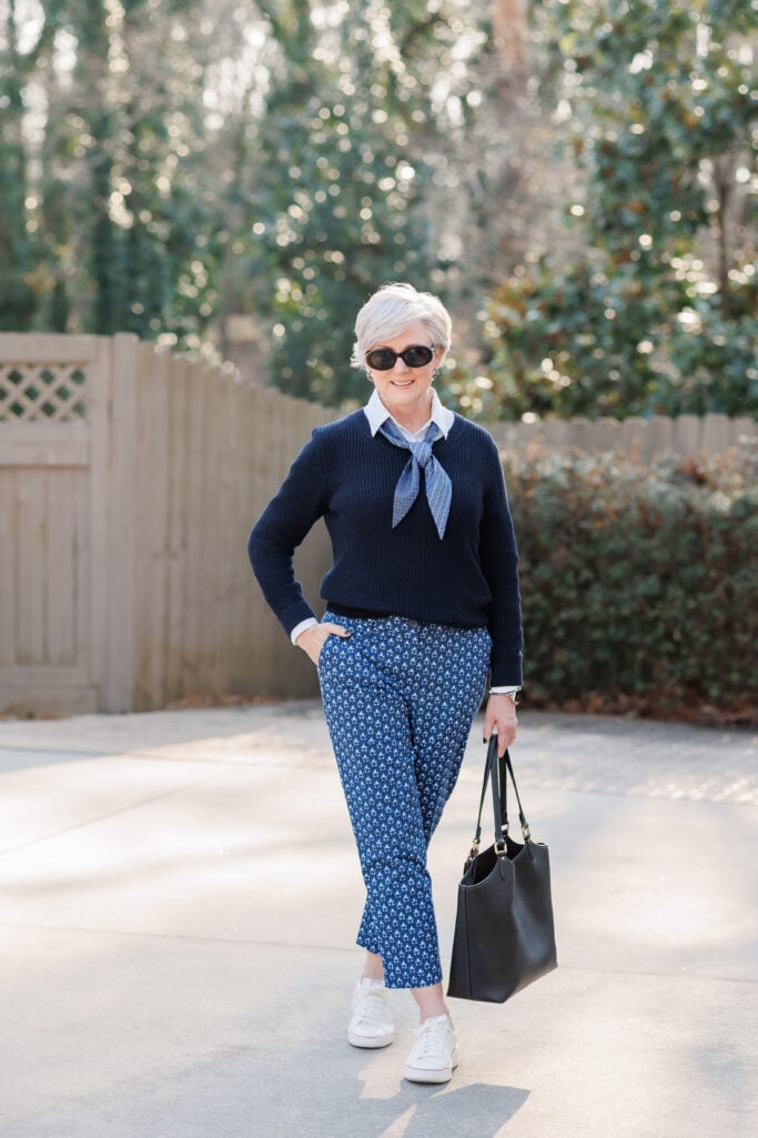
Here’s what I’ve come to believe after more than a decade of writing about bold color and pattern for women over 50: the “safe” choice is actually the risky one. Bold color (and let’s not forget about bold pattern) isn’t too much after 50 — it’s the most flattering thing you can wear.
“Playing it safe is not actually safe. It’s just invisible.”
When we reach a certain age, a lot of us quietly retreat into a uniform. Beige. Black. Navy. Grey. The classics, we call them. Easy, we say. And they are easy. But there’s a difference between a wardrobe that’s easy and one that’s working for you — and I want to talk about that difference today.
Because the women who look the most vital, the most current, the most like themselves? They are almost never the ones in head-to-toe neutral. They’re the ones who showed up in a tomato-red trouser, a bold navy floral, or a leopard jacket thrown over an ivory turtleneck. They’re the ones you remember.

What You’ll Find in Today’s Post
- Key takeaways
- Why women over 50 shy away from bold color and pattern
- What bold color and pattern actually do for women over 50
- How to wear bold color after 50 without feeling overwhelmed
- The best bold colors for women over 50 this spring
- FAQs – Bold color and pattern for women over 50
- “Style has no expiration date. And neither do you.”
- More Spring Inspiration
Why women over 50 shy away from bold color and pattern
Now, let me be clear about something before we go further: every smart classic wardrobe is built on neutrals. Your white shirts, your camel trousers, your navy blazer, your well-cut black everything — those are the foundation. I’m not here to talk you out of any of it. I own them. I love them.
But a foundation isn’t the whole house. And somewhere along the way, a lot of women over 50 stopped building — and started just living in the foundation. Bold color feels risky. Pattern feels like too much. The safe thing, the sensible thing, is to stay neutral.
That instinct is worth questioning. Dressing to disappear is not modesty. It’s not practicality. It’s not even minimalism. It’s just a habit that got started somewhere and never got challenged. And it ages you — not in the way that “bold prints age you” (they don’t), but in the specific way of looking like you’ve stopped caring. Stopped showing up. Stopped being interested in yourself.

What bold color and pattern actually do for women over 50
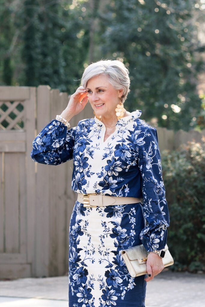
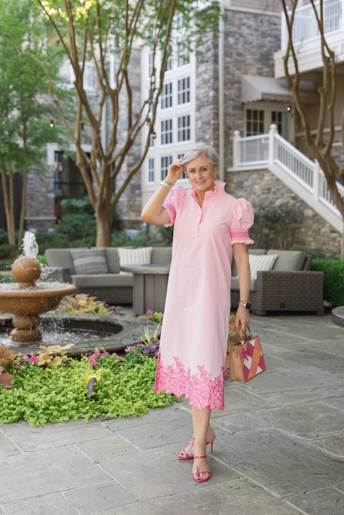
Color near your face is one of the most effective styling tools available to you. As our skin tone shifts with age, warm, saturated color — coral, cobalt, rich navy floral, even a tomato red pant that bounces light upward — does what no amount of foundation can replicate. It reflects warmth back onto your face. It makes you look alive.
Pattern does something similar. A strong print — especially one with contrast — gives the eye something to travel. It creates visual interest and dimension. It says: this outfit was chosen deliberately by a woman who knows exactly what she’s doing. That reads as confidence. And confidence, at any age, is the most flattering thing you can wear.
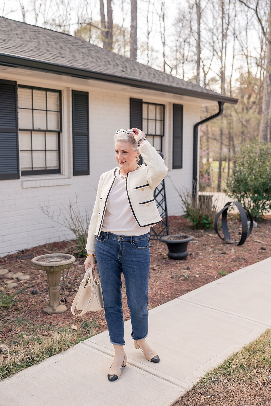
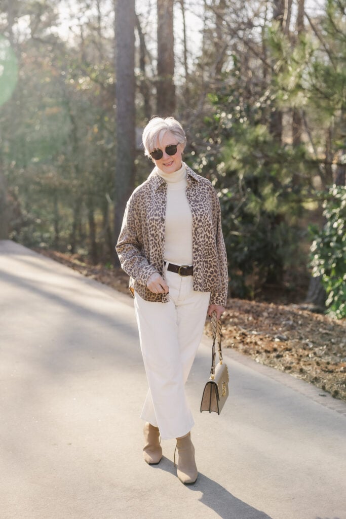
- Xirena Leopard Jacket
- J.McLaughlin Arlette Turtleneck
- Madewell Ivory Barrel Leg Jeans
- Cosy Island Boots
- Two Tone Caviar Earrings
- Tory Burch Kira Handbag (old, similar here)
How to wear bold color after 50 without feeling overwhelmed
I’m not telling you to overhaul your closet. I’m telling you to step outside the box — just a little. Here’s how to wear bold color and pattern after 50 without feeling like you’ve wandered out of your own skin:
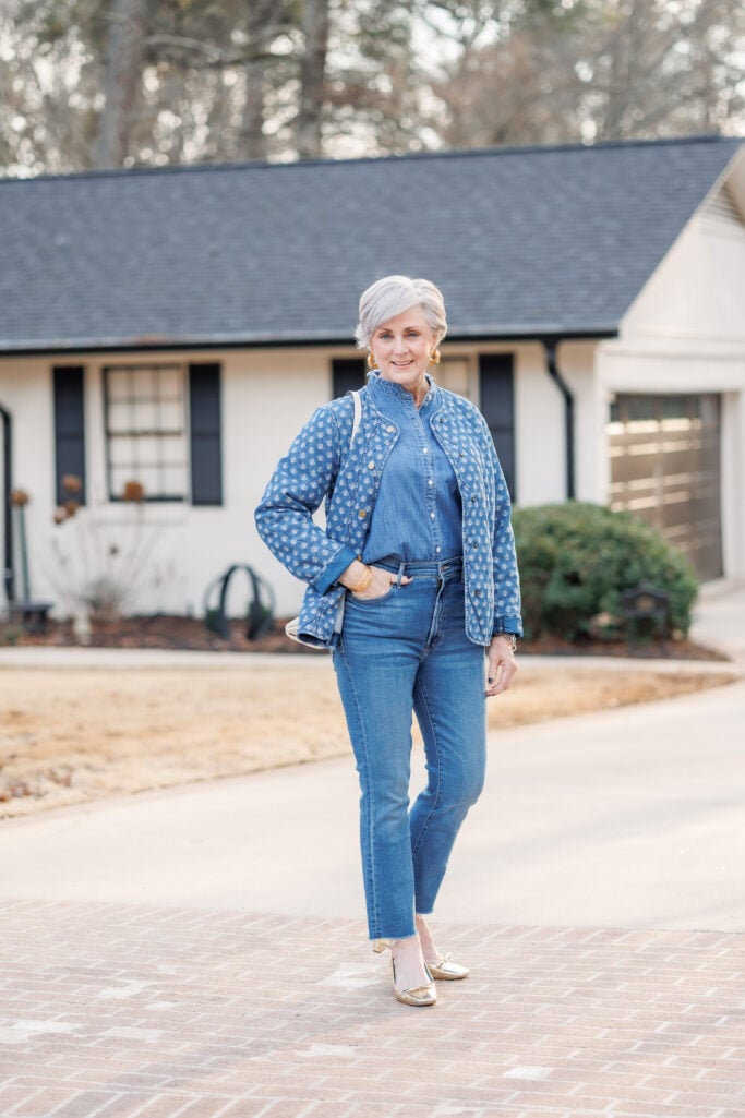
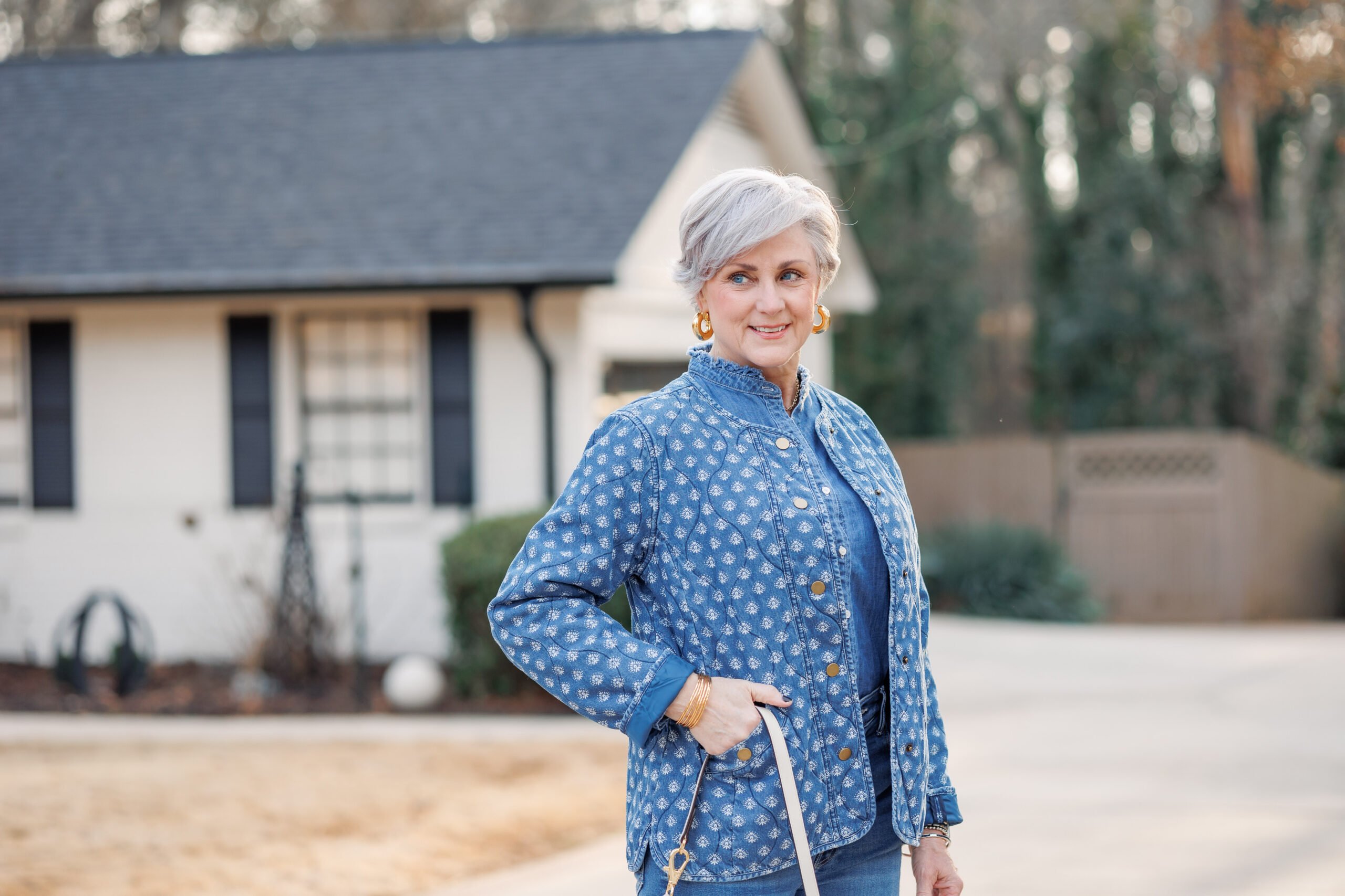
Start with a neutral anchor. The leopard jacket above is over an ivory turtleneck and white wide-leg trousers. The boldness of the print is doing all the work; everything else is quiet. Your neutrals don’t disappear — they just become the supporting cast.
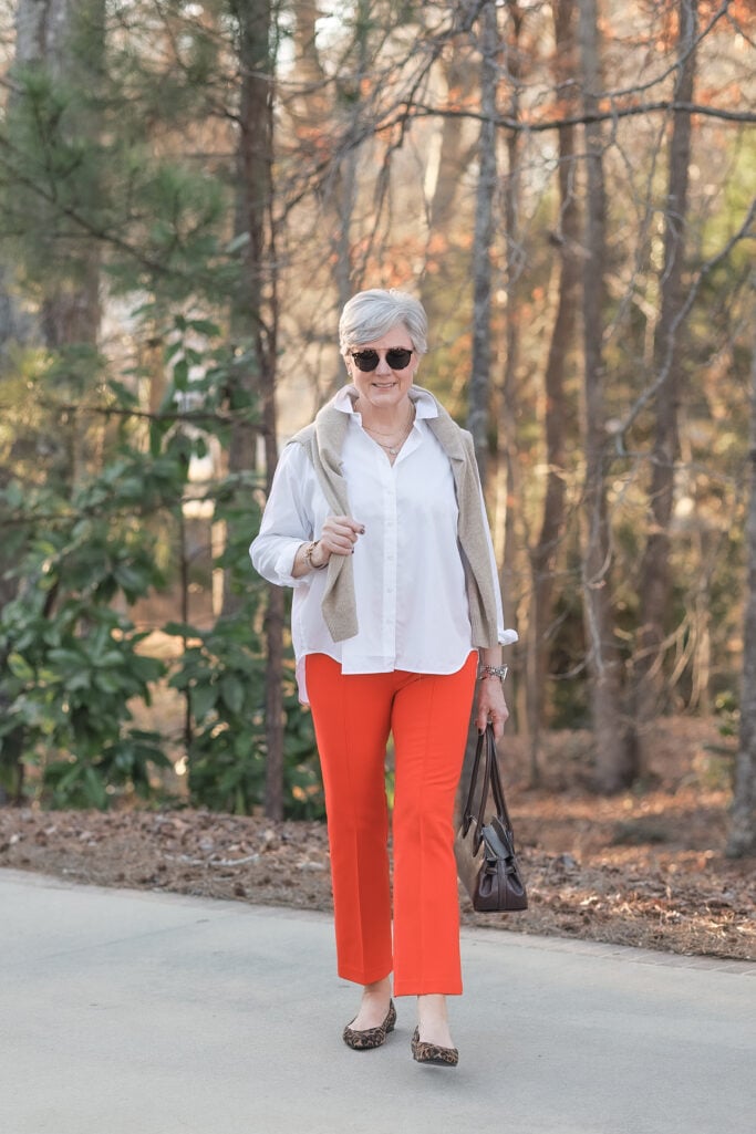
Try color on the bottom half first. A pair of red or tangerine trousers with a crisp white shirt is a completely manageable starting point. Styled right, it’s not loud — it’s just interesting.
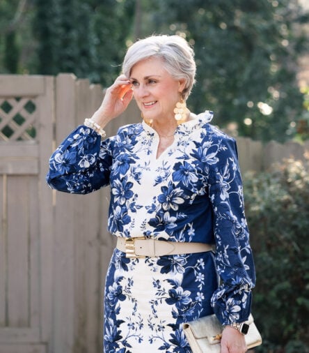
Let the print be the outfit. When I wear the navy floral set, there’s very little else to think about. Strong accessories, clean footwear, and done. A bold print actually simplifies your getting-dressed routine because the outfit makes its own statement.
The best bold colors for women over 50 this spring
Here’s the thing about color: spring and summer are the perfect time to experiment. The lighter fabrics, the longer days, the brighter natural light — everything about the season makes bold color feel more natural and less intimidating. If you’ve been waiting for a sign to try something new, this is it. There is no better moment than right now.
And spring 2026 is particularly well-timed. The colors showing up everywhere right now — cobalt blue, tomato red, hot pink, rich navy florals — happen to be some of the most flattering shades for women with silver or grey hair and mature skin tones. Warm, saturated color near the face creates radiance. It’s not a trend coincidence. It’s just good fortune that what’s fashionable right now is also genuinely flattering.
Leopard, of course, is a neutral that never goes out of style. If bold solid color feels like a stretch, start there — it pairs with everything in your existing wardrobe and adds instant personality without a single neutral leaving the building.
FAQs – Bold color and pattern for women over 50
Is bold color flattering for women over 50?
Yes — bold color is one of the most flattering choices for women over 50. Warm, saturated shades worn near the face reflect light onto the skin and create a more vibrant, youthful appearance. Playing it safe with head-to-toe neutrals can actually wash out mature skin tones.
What colors look best on women over 50?
Jewel tones and warm saturated shades tend to be most flattering for women over 50 — cobalt blue, coral, tomato red, hot pink, and rich navy. These complement silver and grey hair beautifully and add warmth to mature complexions.
Are bold prints too much after 50?
Not at all. Bold prints — florals, leopard, graphic patterns — work beautifully after 50 when anchored by neutral pieces. Keep one element bold and let everything else support it, and the result reads as confident and intentional rather than overwhelming.
When is the best time to experiment with color?
Spring and summer are the perfect time to experiment with bold color and pattern. Lighter fabrics, brighter natural light, and the energy of the season make it the lowest-risk, highest-reward moment to try something new in your wardrobe.
How do I start wearing more color if I always default to neutrals?
Start with one piece. Every great wardrobe is built on neutrals — but don’t be afraid to step outside that box. A colorful trouser paired with a white shirt, a bold blazer over neutral separates, or a printed scarf are all low-commitment ways to start. Once you see the difference color makes near your face, you’ll wonder why you waited.
“Style has no expiration date. And neither do you.”
I stood in a room full of accomplished, interesting women this morning, and most of them were dressed like they’d already decided the world didn’t need to notice them. I want to push back on that — hard.
Your neutrals are not going anywhere. Keep them. Love them. But don’t let them be the whole story. Spring is here. The light is better. The fabrics are lighter. There has never been a more natural moment to step outside the box.
Wear the print. Wear the color. Be the woman people remember when they walk into the room. That’s not too much. That’s exactly right.
| 💬 Tell me in the comments: What’s the boldest thing in your closet right now? |
| 📩 Want more like this? Join the Grit & Glam Club — my newsletter with outfit ideas, beauty finds, and the kind of honest style conversation we have here every week. Subscribe here – it’s absolutely free! |
/


LEAVE A COMMENT