

Every season I go down the color trend rabbit hole — runway reports, Pantone forecasts, what’s actually landing in stores — and then I translate it for real life. My life. Your life. Which is to say: not the runway.
This spring and summer, the color story is genuinely good. And I say that as someone who is particular about color, because the palette this season is one of the most wearable I’ve seen in years. Butter yellows that are warm without being jarring. Cobalts that look extraordinary next to silver hair. Corals that add depth without drama. And Pantone’s Color of the Year — a soft white called Cloud Dancer (a soft white) — that makes everything it touches feel a little more polished.
Today I’m breaking it down color by color: what’s trending, why it works for women over 50 specifically, and how to wear it without overthinking it. You don’t have to wear all of these. You don’t have to wear any of them. But I’d wager at least one of these shades is about to become your new favorite.
Read on to Shop Beth’s Cover Look…
What You’ll Find in Today’s Post
FAQS – Spring Colors for Women Over 50
The standout colors for spring/summer 2026 are butter yellow, cobalt blue, soft violet, cherry red, blush pink, sage green, and a warm soft white (Pantone’s Color of the Year, Cloud Dancer). It’s a palette that balances optimism with wearability — and most of these shades are particularly flattering on women over 50.
Pantone’s Color of the Year for 2026 is Cloud Dancer — a soft, balanced white that reads as clean and modern without being stark. It’s an easy wear for women over 50 and works beautifully in linen, silk, and crêpe for spring.
Butter yellow, blush pink, cobalt blue, and soft violet are especially flattering on midlife skin tones. These shades add warmth or luminosity near the face — which is one of the most effective styling tools available. Cobalt is particularly striking with silver or white hair.
Absolutely — and spring 2026 is the season to do it. The key is wearing color in a way that feels intentional rather than costume-y. One statement color piece, grounded by a neutral, is the most sophisticated and flattering approach. Think a cobalt blazer with white trousers, or a butter yellow dress with nude accessories.
Cloud Dancer (soft white) is the season’s universal neutral — it softens bright colors and sharpens pastels without competing. Camel and warm beige also work beautifully with the season’s palette, particularly with violet, butter yellow, and blush.
✨ Beth’s Style Tip: If you’re nervous about color, start with accessories. A cobalt bag, a butter yellow scarf, a blush flat — these are commitment-free ways to test a shade before you invest in a whole outfit.
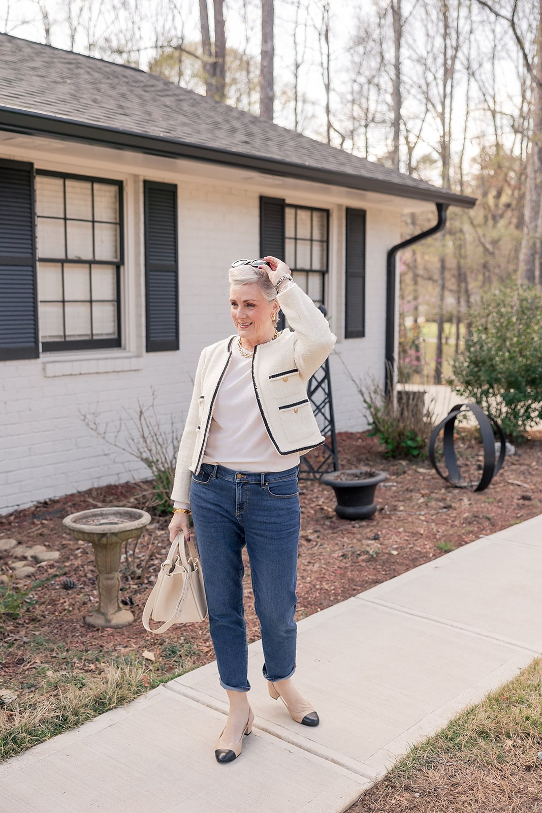
Wonderful, Wearable White
Pantone named Cloud Dancer its Color of the Year for 2026 — but here’s what that actually means when you’re shopping: you’re not going to find a tag that says “Cloud Dancer.” What you will find is a whole lot of soft white showing up everywhere right now, in every form imaginable. Fresh ivory. Cool stone white. Warm cream. Alabaster. Off-white with a hint of blush. Retailers all call it something slightly different, but the through-line is the same: white, softened.
And that softening is exactly what makes it so wearable. It’s not the stark, bright white that can read as harsh under certain lighting or against certain skin tones. These are whites that have warmth, or depth, or just enough of a whisper of another color to feel gentle rather than clinical. For women over 50 — especially those with silver or white hair — soft white creates a luminous, tone-on-tone effect that is genuinely stunning.
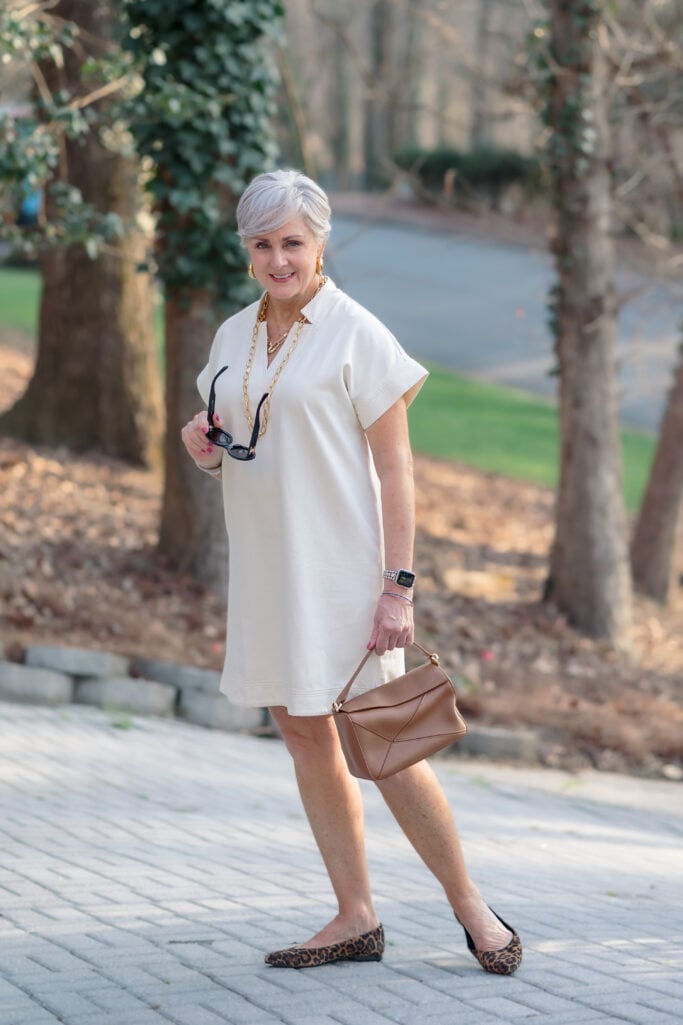
This is also the color that makes everything else in your closet work harder. A soft white dress is a canvas. Add a cognac bag and leopard flats and it has an edge. Wear it tonal head to toe and it becomes the most sophisticated thing in the room.
Shop Beth’s Look
Go Elevated Casual
This is the soft white look for the woman who wants polish without effort. A lace tank and kick flare pants — both in that fresh ivory we’re talking about — create an effortless tonal base. The cropped denim jacket is what makes it interesting: it adds texture, a little structure, and just enough contrast to keep the look from feeling too precious. Gold accessories throughout — hoops, a link necklace, a bracelet, the hardware on the bag — warm the whole thing up. The gold bit on the mules finish it perfectly. This is a weekend outfit that looks like you planned it, even if you didn’t.
Shop Beth’s Look
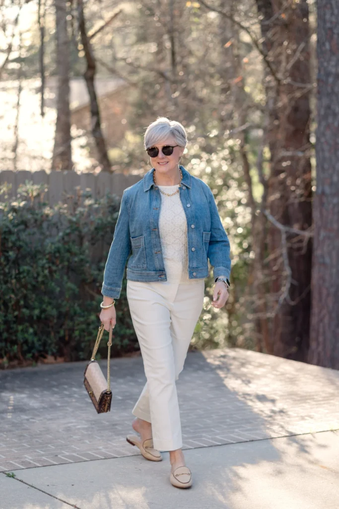
✨ Beth’s Style Tip: When you’re dressing in soft white head to toe, texture is everything. Lace, denim, canvas — three different surfaces that all speak the same color language. That’s what keeps a tonal look from reading as flat.
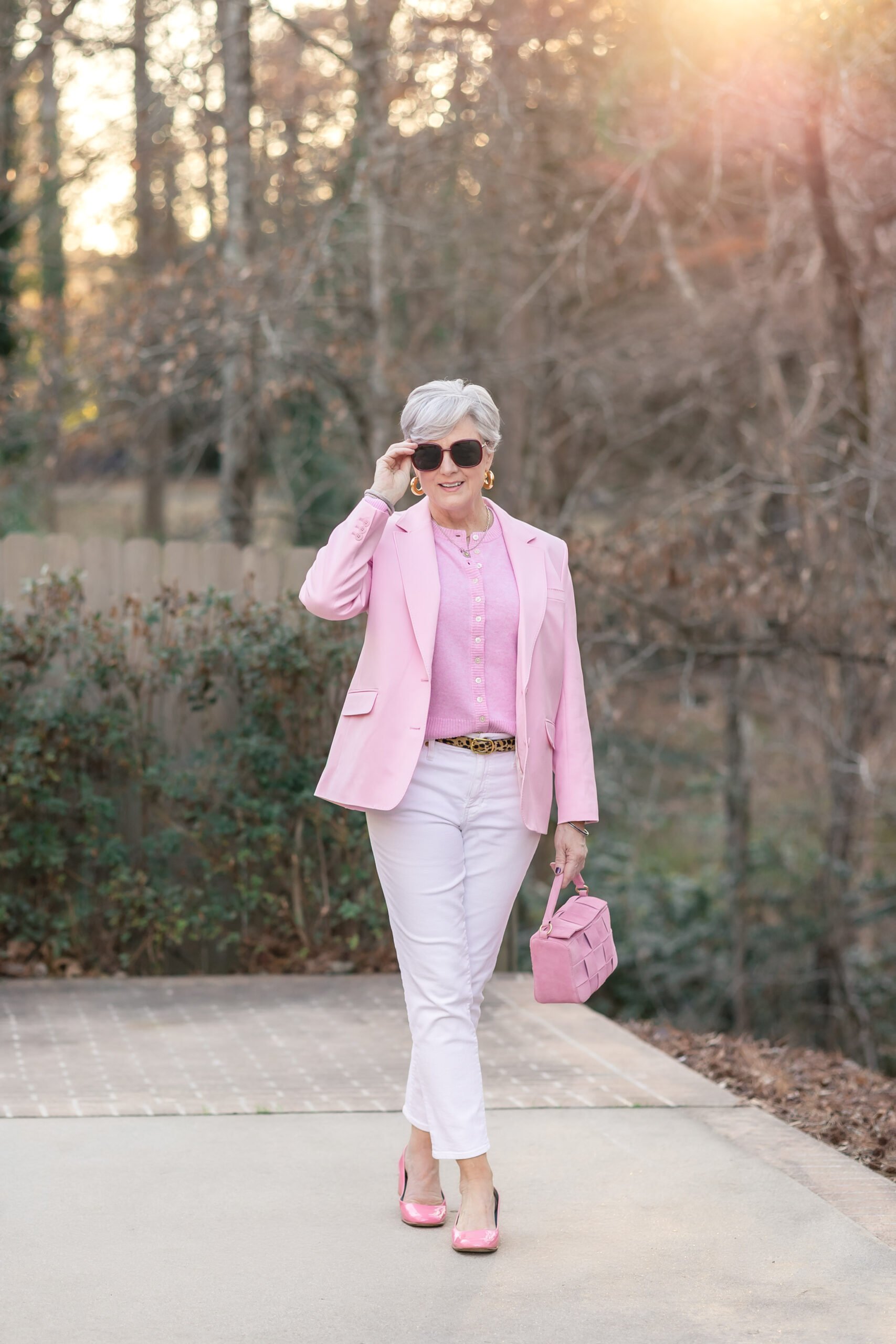
Perfectly, Unapologetically Pink
Pink is having its most sophisticated moment in years. Not saccharine, not girlish — this is pink with authority. The spring 2026 version leans into the blazer, the matching tonal layer, the deliberate head-to-toe approach that says “I chose this on purpose.”
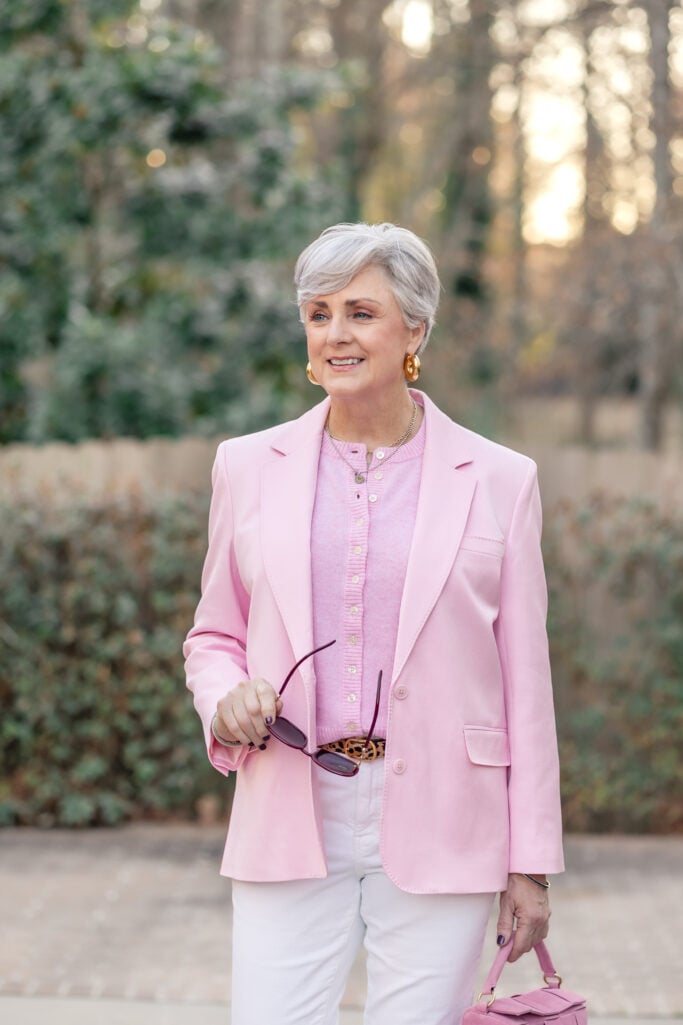
The formula here is simple and endlessly wearable: a pink blazer over a pink cardigan, grounded by white denim. The leopard belt is the detail that prevents the look from reading as too sweet. Accessories stay warm — gold hoops, a toggle necklace, a blush suede bag. It’s confident without being loud.
Shop Beth’s Look
✨ Beth’s Style Tip: Tonal dressing in one color family — like pink on pink — reads as effortlessly chic rather than matchy. The key is varying the texture: a structured blazer over a soft knit creates enough contrast to keep it interesting.
Mellow in Yellow
Yellow is a color I keep coming back to this season – and again you’ll find variations on this color. You will find it on the warmer and cooler spectrums, either way, It’s luminous. And unlike some of the brighter yellows trending on the runway, butter yellow actually works as a near-neutral — it pairs with brown the way camel pairs with navy. Naturally.
This look is a perfect case study in how to ease into a trending color without overthinking it: a yellow cardigan layered over a white shirt, grounded by rich chocolate brown trousers. The result feels warm, considered, and completely wearable for a real spring day.
Shop Beth’s Look
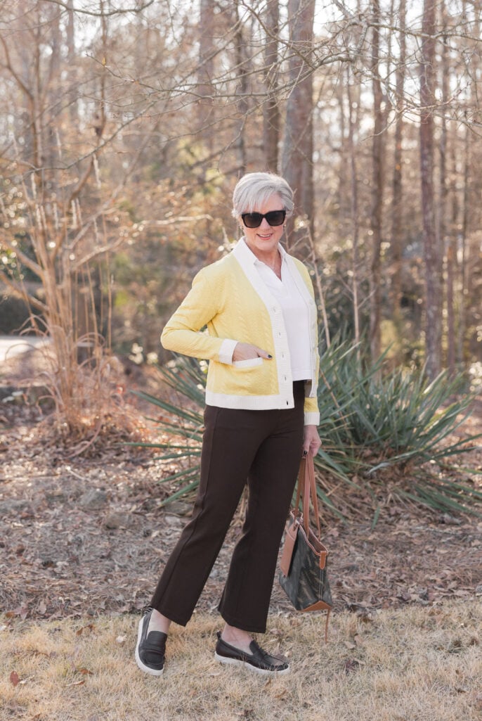
✨ Beth’s Style Tip: Pair butter yellow with chocolate brown instead of the expected white or navy — it’s a warmer, more unexpected combination that makes the yellow feel grounded rather than cheerful-for-cheerful’s-sake.
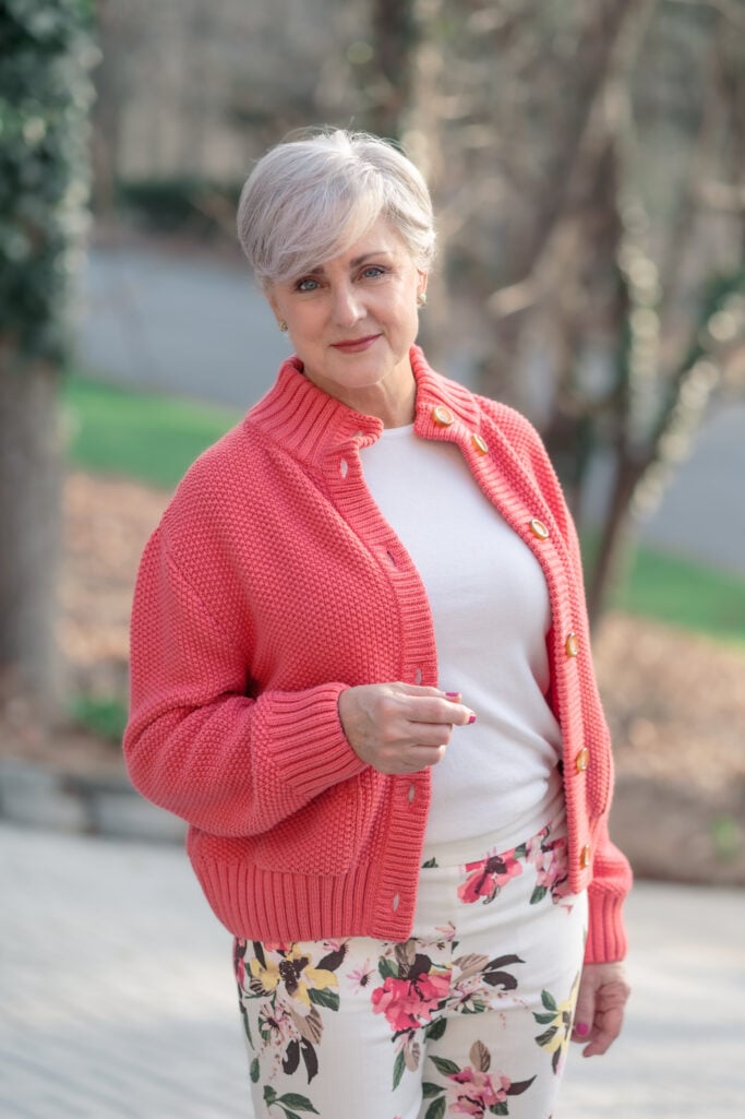
Charmed by Coral
Coral sits at the happy intersection of pink and orange — warm enough to feel energetic, soft enough to feel approachable. It’s the color that looks intentional next to silver hair without requiring much else to make it work.
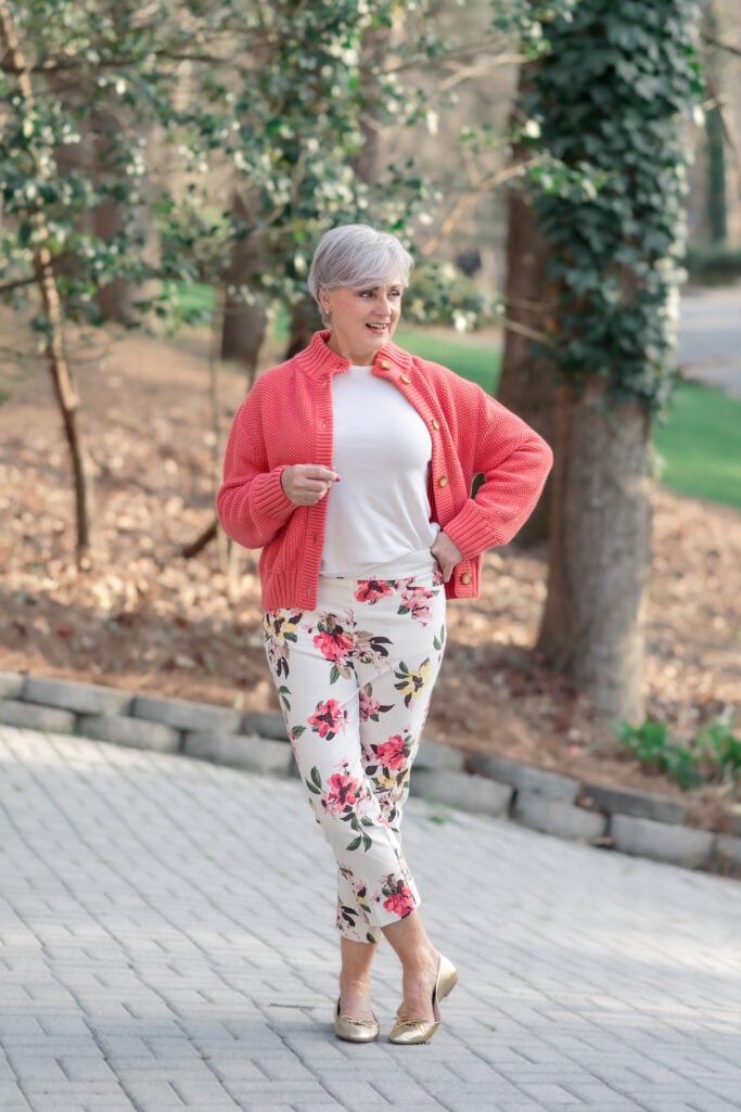
This look makes the case for coral as a layering color: a chunky cotton sweater jacket in coral over a crisp white tee, paired with floral crop pants that pull the coral through in their print. The gold ballet flats keep it polished. The overall effect is relaxed, spring-ready, and genuinely joyful to wear.
Shop Beth’s Look
✨ Beth’s Style Tip: When your pants have a print that includes your top color, you don’t need much else. This is a two-piece look that does all the work — just add a simple shoe and you’re done.
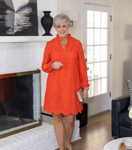
Own the Orange
Orange is the boldest move in this post — and I’m here for it. Not an orange that hedges. Not a burnt or muted version. This is orange with full conviction: a lace shift dress that owns the room, and a pair of orange flare pants that prove the color works just as hard in separates as it does in a dress.
Shop Beth’s Look
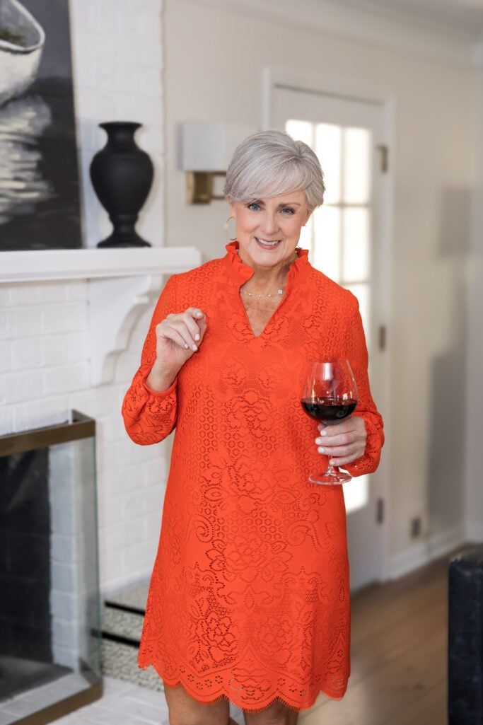
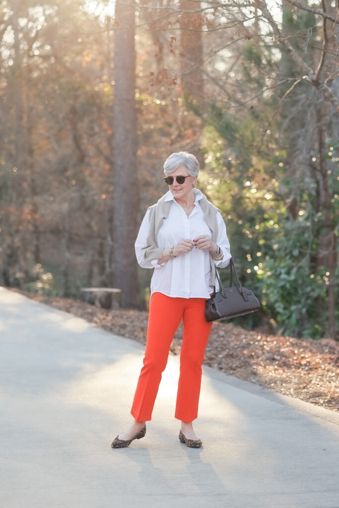
The secret to wearing orange without it wearing you? Keep everything else simple. The dress needs only gold sandals and a clutch. The pants need only a crisp white button-down. The color is the statement — everything else is support.
Shop Beth’s Look
Shop Kelly’s Look
✨ Beth’s Style Tip: Orange and gold are a natural pairing — warm tones meeting warm metal. Skip silver entirely when you’re wearing this color. It’s a small detail that makes the whole look feel more considered.
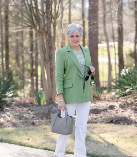
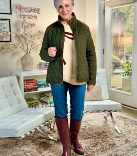
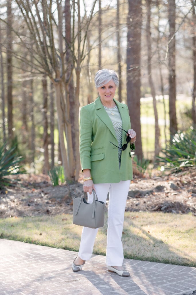
Gloriously Green
Green is the quiet one in the spring 2026 palette — and sometimes the quiet one is the most useful. A sage or apple green blazer works like a neutral in the sense that it grounds a look without competing with it. It also has a freshness that reads as genuinely seasonal without screaming “I dressed for spring.”
The trick with green, as with most colors, is in the pairing. White keeps it clean and modern. A striped tee — especially one that pulls the green into its pattern — creates tonal interest without adding visual noise. Taupe and ivory accessories (like the Lane Leather Mini Tote and ivory Ballet Flats) can pick up the green tones and act as a neutral that takes the look from “pretty” to “polished.”
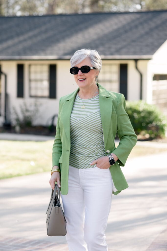
✨ Beth’s Style Tip: If you’re adding a statement-color blazer, let one accessory echo it subtly — here, the striped tee picks up the green so the look feels cohesive rather than like a blazer thrown over an outfit.
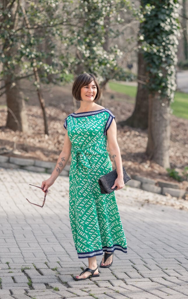
And then there’s this: a green print dress that commits fully to the color and asks nothing of you in return. The Maeve Hanky Hem Midi Dress is a one-and-done outfit — the print does the talking, the silhouette does the work, and all you need is a sandal and a clutch. That’s the best kind of spring dressing.
Shop Kelly’s Look
Brilliant in Blue
There’s a reason cobalt and navy keep showing up on every spring runway: they’re among the most flattering colors you can put next to silver and white hair. The contrast is striking without being harsh. It has the quality of something polished, something intentional — the kind of color that makes people ask, “Where did you get that?”
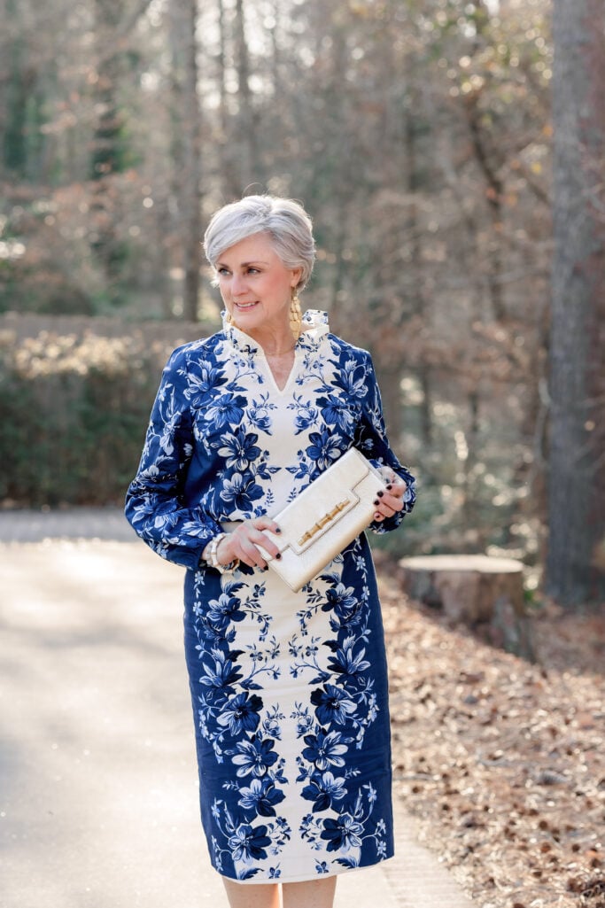
This season, navy gets the full color moment it deserves, especially in prints. The Exquisite Blooms print does something clever: it takes a bold color and softens it with a classic floral and neutral navy, so the look reads as sophisticated rather than loud. Dress it up with the matching skirt for an event, or pull it back with ankle jeans and a kitten heel thong sandal for a spring lunch that still looks considered.
Shop Beth’s Look
Go Elevated Casual
Shop Beth’s Look
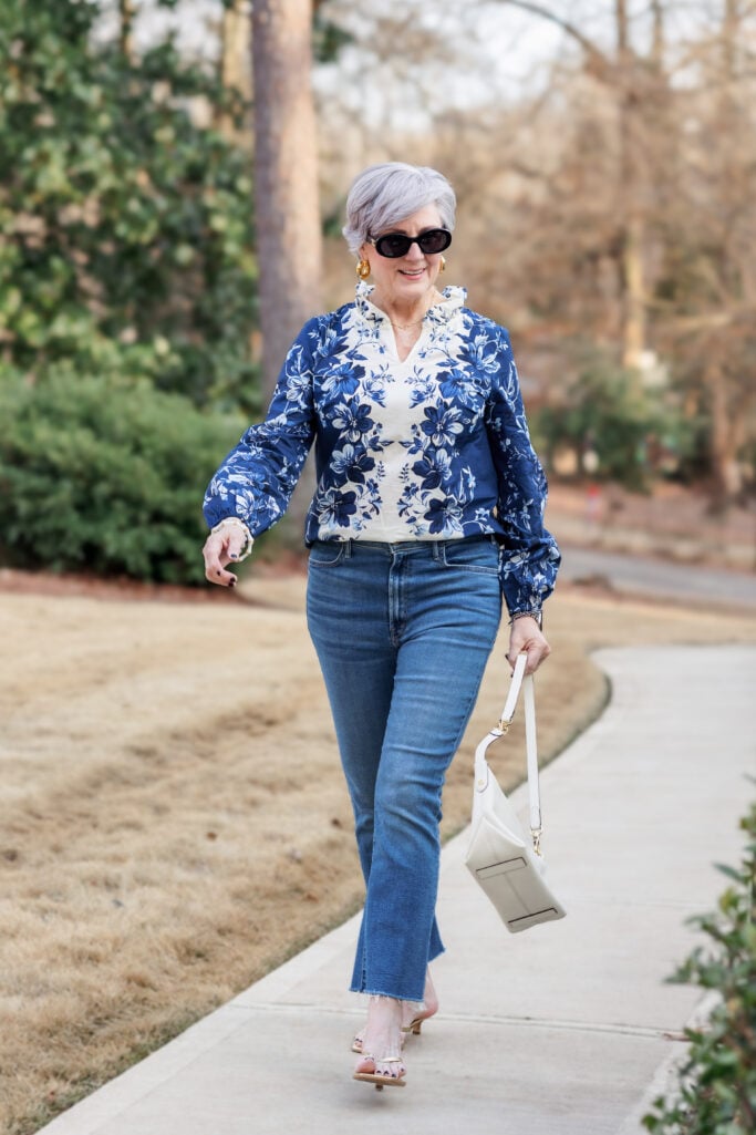
✨ Beth’s Style Tip: Cobalt and navy are particularly striking with silver and white hair — the contrast does what a highlighter can’t. If you’ve been hesitant about bold color, start here.
Video: Spring 2026 Jewelry Trends
Now that we’ve talked about outfits in the freshest colors of 2026, check out my video on Spring 2026 Jewelry Trends and find the perfect way to accessorize your colorful outfits!
Spring 2026 jewelry has one message: stop whispering. The runways sent sculptural gold down the catwalk, oversized earrings that demand attention, and pearls that have officially left your grandmother’s jewelry box. I’ve been shopping these trends, wearing them, and I’m here to tell you—this is the most fun we’ve had with accessories in years.

More Spring Style Inspiration on The Blog
- Spring Dresses for Women Over 50: Two Talbots Looks That Do All The Work
- How to Wear a Bold Spring Dress When You’re Petite – And Why You Should!
- 7 Best Spring Dresses For Women Over 50
- 5 Spring Style Tips For Women Over 50
- 10 Spring Accessories That Make Every Outfit Look Expensive
- Spring Maxi Dresses for Petites: 3 Styles That Actually Work
Closing Thoughts – Spring Colors for Women Over 50
You don’t need all of these colors in your closet. You need one — the one that makes you feel most like yourself when you put it on. Start there. Shop the rest slowly. Color is not a commitment; it’s an experiment. And the best part is that you discover a new favorite.
Find your color. Then wear it like you meant it all along.
LEAVE A COMMENT